Decades Apartby
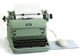
LN13Comment by tristalisk: Greetings From the Critique Club!!!
Initial Imapact: WOW thats good!!
Meeting the Challenge: I didn't even have to look to see that this was clearly for the Odd couple challenge.
Focus: Dead on. It can't possibly get any better than this.
Color: I like the drab green But I feel that the mouse and pad Could use a bit of color to help it feel even more "modern". The tonal range and colors that are present are all perfect.
Composition: Oce again looks great.
Lighting. This is the only area I can spot any technical aspects that could be improved. I don't like the shado on the left of the typewritter. I think Using another light from the left to remove it would have moved this great shot up another knotch.
Overall: Not a real exciting subject. Or necessarily pretty. This will probably keep this image away from the ilusive ribbon, but I can easily see this as a stock image or a poster. This image make lack in aqppealing to the masses but it is technicaly a spectacular photo.
Keep up the great work!! I look forward to voting on more entries like this one.
Tristalisk