| Image |
Comment |
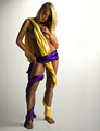
| 07/01/2006 11:11:58 PM |
purpleandyellow1web.jpgby trnqltyComment by yanko: I notice you like to add/enhance highlights via dodging and here I think you did it very well. It definitely adds an extra element of appeal to an already appealing image. :P
I agree with SamDoe about the darkness but only in regards to her legs, mainly from lower thighs down. Her feet especially look too dark. The other thing is the dark blotch/vignette in the top left corner. I don't know why but those things always bug me. If it were me I would brighten it just a bit so it wasn't so noticable. |
 Photographer found comment helpful. Photographer found comment helpful. |
| 07/01/2006 11:01:12 PM |
txcapitol.jpgby trnqltyComment by yanko: When I shot mine I didn't like the actual colors so I ended up going in a different direction but you made them look good. I also like how you have more contrast up towards the top. The blue from the windows also adds a nice touch something I think mine was lacking. The one thing I don't like is the cut off ring on the right. Other than that it's a keeper. Message edited by author 2006-07-01 23:02:17. |
| Photographer found comment helpful. |
| 07/01/2006 10:52:36 PM |
valpainting.jpgby trnqltyComment by yanko: Very interesting image. I think you blurred the foreground just right keeping enough detail. The background is busy but you managed to not make it a distraction. I like how the main subject is contrasted against that dark curtain/wall. Without that the feel of this image would have been quite different, IMO. Great job all around. |
| Photographer found comment helpful. |
| 07/01/2006 10:39:32 PM |
julieedit.jpgby trnqltyComment by yanko: First off, let me say I really like how you crop your images. This is another good one in that regard. The smoothness of her doesn't bother me but the flattness does. I think if this was a color image it would look fine but as a b/w the tones are just too flat for me. |
| Photographer found comment helpful. |
| 06/30/2006 08:45:28 PM |
|
| Photographer found comment helpful. |
| 06/29/2006 07:52:27 PM |
valpainting.jpgby trnqltyComment by DjFenzl: This is really great - the expression on her face really conveys the message.
The only thing that bothers me a bit are some of the angles in the photo. The easle tilts quite a bit making it kind of an odd angle. Also the assumption is that she's looking in a mirror but there is no indication of a mirror. Makes it feel a bit like a collage? |
| Photographer found comment helpful. |
| 06/27/2006 09:48:30 PM |
txcapitol.jpgby trnqltyComment by SJCarter: Beautiful capture, although the right crop seems a bit tight. Love the color tones and nice sharp focus. Well done. |
| Photographer found comment helpful. |
| 06/27/2006 09:46:33 PM |
|
| Photographer found comment helpful. |
| 06/27/2006 09:45:57 PM |
julieedit.jpgby trnqltyComment by SJCarter: I like the "in your face" composition and tones. The editing is good too, although her skin looks a little "too" smooth. Great eye job. ;-) |
| Photographer found comment helpful. |
| 06/27/2006 09:44:45 PM |
DSC_3289web.jpgby trnqltyComment by SJCarter: I really like the wide-angle and POV. The mismatched proportions work well with the setting and color choices IMHO. Nice work. |
| Photographer found comment helpful. |
Home -
Challenges -
Community -
League -
Photos -
Cameras -
Lenses -
Learn -
Help -
Terms of Use -
Privacy -
Top ^
DPChallenge, and website content and design, Copyright © 2001-2026 Challenging Technologies, LLC.
All digital photo copyrights belong to the photographers and may not be used without permission.
Current Server Time: 07/23/2026 04:25:30 AM EDT.