| Author | Thread |
|
|
03/01/2007 10:10:32 PM |
|
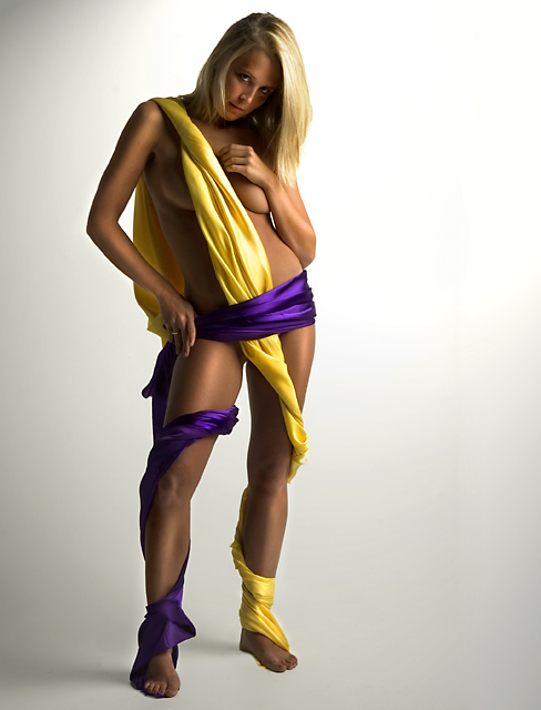
I must disagree with the other posts, I think the dark element of her face is exactly correct, it adds a touch of mystery and intrigue, as for the legs...she has a tan, and the vignette is perfect it adds drama to the shot. I love it!! |
|
 Photographer found comment helpful. Photographer found comment helpful. |
|
|
11/09/2006 07:00:57 PM |
|
where do you find these amazingly hot women? just curious. as for the photo, i like the way the silken reflections seem to carry onto her skin. very nice. |
|
| Photographer found comment helpful. |
|
|
07/01/2006 11:11:58 PM |
I notice you like to add/enhance highlights via dodging and here I think you did it very well. It definitely adds an extra element of appeal to an already appealing image. :P
I agree with SamDoe about the darkness but only in regards to her legs, mainly from lower thighs down. Her feet especially look too dark. The other thing is the dark blotch/vignette in the top left corner. I don't know why but those things always bug me. If it were me I would brighten it just a bit so it wasn't so noticable. |
|
| Photographer found comment helpful. |
|
|
05/19/2006 03:22:20 PM |
this one woulde probably have done much better in the complimentary colours challenge than your submission, boob shots allways do ;)
I say the same as samdoe1 she is a bit to dark but I thinki it dosent hurt it that much, would have liked to see a bit tighter crop but thats the only things i can see.. over all.. very nice job! |
|
| Photographer found comment helpful. |
|
|
05/09/2006 09:40:09 PM |
|
I love the pose and the idea for this one, but the face is too dark for me. Actually, most of her body is too dark and in the shadows. I'm not sure if this is the effect you were going for or not, but just my opinion. Great job. |
|
| Photographer found comment helpful. |
Home -
Challenges -
Community -
League -
Photos -
Cameras -
Lenses -
Learn -
Help -
Terms of Use -
Privacy -
Top ^
DPChallenge, and website content and design, Copyright © 2001-2026 Challenging Technologies, LLC.
All digital photo copyrights belong to the photographers and may not be used without permission.
Current Server Time: 07/02/2026 08:17:48 AM EDT.