| Image |
Comment |
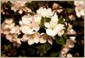
| 05/18/2004 01:03:53 PM |
A Center Pieceby TikicharmComment by Olyuzi: To my eye, there is not enough of seperation between main subject and background, creating some confusion even with the narrow DOF you've achieved. I think the problem lies in the lighting and common toning/coloring. I also find the lighting to be too bright on the main flowers...contrast is too high here and you have nearly blown out areas and very dark shadows. A little hard to look at. |
 Photographer found comment helpful. Photographer found comment helpful. |
| 05/18/2004 10:16:08 AM |
Tall and Shortby TikicharmComment by dahved: Cool! I wish the horizontal line on the left was hidden, and the vertical dividing line was truly vertical. 7 |
| Photographer found comment helpful. |
| 05/17/2004 11:39:41 PM |
|
| Photographer found comment helpful. |
| 05/17/2004 06:06:20 PM |
|
| Photographer found comment helpful. |
| 05/17/2004 02:41:40 PM |
|
| Photographer found comment helpful. |
| 05/17/2004 04:16:27 AM |
|
| Photographer found comment helpful. |
| 05/16/2004 12:08:36 PM |
My Life in Ruinsby TikicharmComment by Beagleboy: That overly bright lightsource on the right is very distracting. The intensity of it seems to almost wash out the crispness of the runes on the stones. There also seems to be some sort of reflection on the bottom part of the background image with the swords and cross. Continue experimenting with your lighting technique to refine it. |
| Photographer found comment helpful. |
| 05/15/2004 09:43:48 PM |
|
| Photographer found comment helpful. |
| 05/15/2004 08:27:15 PM |
Tall and Shortby TikicharmComment by lindsay: I think it would look a little cleaner if the white background were a little more uniformly white.. but I really like this, overall! |
| Photographer found comment helpful. |
| 05/15/2004 04:20:38 PM |
|
| Photographer found comment helpful. |
Home -
Challenges -
Community -
League -
Photos -
Cameras -
Lenses -
Learn -
Help -
Terms of Use -
Privacy -
Top ^
DPChallenge, and website content and design, Copyright © 2001-2026 Challenging Technologies, LLC.
All digital photo copyrights belong to the photographers and may not be used without permission.
Current Server Time: 07/16/2026 12:44:41 PM EDT.