| Image |
Comment |
| 06/29/2004 12:14:11 AM |
KIDS!by ChefbozComment by C_Steve_G: Too many tongues, not enough eyes! Gray shade under chin of center boy is distracting.
Good idea, though. |
 Photographer found comment helpful. Photographer found comment helpful. |
| 06/28/2004 03:28:33 PM |
|
| Photographer found comment helpful. |
| 06/28/2004 01:54:33 PM |
KIDS!by ChefbozComment by Tallbloke: looks like some nasty photoshop blurring at work here which spoils an otherwise good photo. |
| Photographer found comment helpful. |
| 06/28/2004 12:07:10 PM |
|
| Photographer found comment helpful. |
| 06/28/2004 10:31:05 AM |
KIDS!by ChefbozComment by birgir: I realy don't like how you have blured the body of the boys. And the expression of the boy in the middle are not like on the other two boys. But thats just my 5 cents ... |
| Photographer found comment helpful. |
| 06/24/2004 08:57:31 AM |
Red or White -- It's all the same to me!by ChefbozComment by redmoon: the white wine looks a bit green, really, but overall there are parts of this i really like. i think the light in the shadow and reflections are very lovely, and reasonably well captured. i think it's a bit of a pity that the glasses are not still transluscent, as this might have been more effective. similarly, did you try to position the glasses in a way that the projected shadows match better - for example, there is a entimeter gap between the stem and the shadow on the right, but no gap on the left. just seems a little bit unbalanced. 5. |
| Photographer found comment helpful. |
| 06/23/2004 08:46:39 AM |
Red or White -- It's all the same to me!by ChefbozComment by Beagleboy: This image looks weird. The rflections on the background look nice but I can`t say the same for the glasses. Did you simply desat the glasses or did you paint over them using a PS function? I'm thinking the latter. Good idea, but I would try reworking it. |
| Photographer found comment helpful. |
| 06/23/2004 02:18:23 AM |
|
| Photographer found comment helpful. |
| 06/23/2004 02:00:57 AM |
Red or White -- It's all the same to me!by ChefbozComment by Glacierwolf: What did you desaturate? We can't tell. What were you thinking?????? Notice how the glass stems hold color? The two back ones have glass color, the two front ones show the reflection of the back ones. Desaturated water? |
| 06/21/2004 10:09:38 PM |
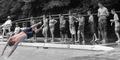
Fun in the sunby ChefbozComment by scalvert: It does meet the challenge, and exposure/focus are fine, so I would have given the shot a 5 or 6 on that basis. The biggest issues are that the subject matter is rather dull (to me, anyway), and the desaturation doesn't really serve much purpose for this type of shot. The subject stands out with composition alone, so it's not really the sort of "red dress in a crowd" situation that would justify the technique (in retrospect, my own entry falls into this category). If entered in any other challenge, people would be asking why you desaturated. Also, the focus seems a little soft (maybe from resizing), and the subject's feet are white- either a PS error or a drawback of using Achilles' Tanning Salon. ;-)
BTW- I lived in the Greenville area until I was 13, so I might have actually used this pool. Message edited by author 2004-06-21 22:21:44. |
| Photographer found comment helpful. |
Home -
Challenges -
Community -
League -
Photos -
Cameras -
Lenses -
Learn -
Help -
Terms of Use -
Privacy -
Top ^
DPChallenge, and website content and design, Copyright © 2001-2026 Challenging Technologies, LLC.
All digital photo copyrights belong to the photographers and may not be used without permission.
Current Server Time: 04/02/2026 07:12:41 PM EDT.