| Image |
Comment |
| 02/19/2003 09:07:27 AM |
|
| 02/18/2003 08:53:14 PM |
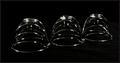
For All Timeby AnnidaComment by Jacko: I like the contrast of the chrome and the black background. I would like to see more focuus and dept of field to make the subject crisper. Jacko |
 Photographer found comment helpful. Photographer found comment helpful. |
| 02/18/2003 08:25:27 PM |
|
| 02/18/2003 11:23:14 AM |
|
| 02/17/2003 11:05:41 PM |
|
| 02/17/2003 06:55:06 PM |
|
| 02/17/2003 02:30:08 PM |
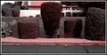
~Not Clever Enough~by AnnidaComment by joshua: critique club comment
Composition
Your composition is pretty strong. I think cropping the photo more on the bottom would increase the focus on your subject. The bush with the leg sticking out is centered which is good for bringing the viewer's attention to the leg. As soon as I saw this pic I knew it was shot in AZ because the colors are so muted. Overall composition is good, but I think it is confusing because I honestly think that the "leg" looks nothing like and actual leg and as I look closer at the picture I can see what looks like a man on the balcony in the background of the pic. Is this what was supposed to be the focal point? It seems by some of the comments that others were confused as well.
Background
The background is good and completes the look of the photo. The cut lines on the grass lead naturally to the background. Nothing Much to add here, sorry.
Technical
This could be just a result of your camera, but I have to say that the main issue with most of your photos is the soft focus on all of the photos. This makes it hard to see details and in a challenge like waldo details are essential. If things were clearer people wouldn't be so confused and it would be easier for you to convey what you need to convey. The lighting is good. It may be a tad dark but not that bad.
There does not appear to be much post processing.
[b]My Opinion[/]
This was one of the more original Waldo shots in the challenge. I like this a lot but the soft focus really hurts the photo because it doesn't give the viewer a chance to figure out what is going on. This is one of the few that actually met the challenge in my opinion, and you should be commended for that. Just work on that focus and you should be set.
|
| Photographer found comment helpful. |
| 02/17/2003 12:00:46 PM |
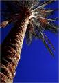
Moon Palmby AnnidaComment by inspzil: Greetings from the Critique Club
By Inspzil
Composition - Great angle for this challenge. I think this is a great subject and the little spec of moon looks nice. The sky is so blue...too blue. The colors of this photo look very odd. As much as I like the angle and the subject, I dislike the colors.
Technical - This photo is really soft. It needs to be focused badly. The exposure needs to be just a little longer to give everything the light it needs. The focus is really a killer to this picture though. It's hard to see past when looking at it. The framing is really good though. The processing is too much tho. The sky is blue to an unbelievable degree. The green seems to be lacking and the lack of clarity on the leaves makes it seem even moreso. There appears to be a little red on the bottom of the tree in the leaves. This also seems odd. My feeling is that it is generally overprocessed.
Overall - This picture could've been really exceptional with a couple of minor changes. THe focus is the biggest one. The processing is the other. The choice of subject was awesome and the addition of the moon is a nice touch but it isn't enough to overcome the lack of focus though. Hope this could be of some help to you. - Inspzil |
| Photographer found comment helpful. |
| 02/17/2003 02:09:23 AM |
|
| 02/17/2003 01:27:16 AM |
|
| Photographer found comment helpful. |
Home -
Challenges -
Community -
League -
Photos -
Cameras -
Lenses -
Learn -
Help -
Terms of Use -
Privacy -
Top ^
DPChallenge, and website content and design, Copyright © 2001-2026 Challenging Technologies, LLC.
All digital photo copyrights belong to the photographers and may not be used without permission.
Current Server Time: 07/16/2026 08:58:43 AM EDT.