| Author | Thread |
|
|
02/25/2003 09:53:46 PM |
CRITIQUE CLUB!
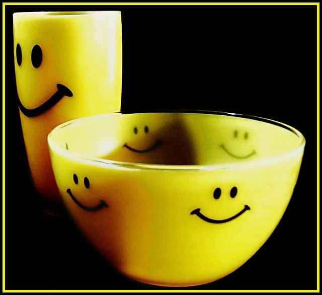
When I make these critiques, I try hard to form my opinion before scrolling down and reading what others had to say. Most of the time I have one or two unique things, but in this case it's almost all been said.
Great concept -- and very topical for the challenge. I also just really like the dishes and think they're fun.
My biggest suggestion for this photo would be to try and fix the lighting. The shadow inside the bowl is the most distracting, but upon looking longer at the photo, the glare on the rim of the bowl and the right of the glass are both pretty pronounced. For more even lighting, remove anything blocking the light on the left and try a lower-wattage bulb OR (my preference) some kind of diffuser on the light on the right (typing paper works well for a quickie -- use 2 or 3 sheets for really subtle light). Working with shiny objects is really really tough to avoid glare, but I used the typing paper trick on this photo.
That's about it. My only other comment is the border. I'm admittedly anti-border, but in this case I think a contrasting or more subtle color would be better. You want the border to help the photo pop out, but don't want it to compete with the image. Here, I think it gets in the way.
Keep on shootin'
Rob |
|
 Photographer found comment helpful. Photographer found comment helpful. |
Comments Made During the Challenge  |
|
|
02/22/2003 11:25:17 PM |
the smiles bring life to this photo |
|
|
|
02/22/2003 03:06:43 AM |
|
good concept. shadows on the bowl are very distracting, though. perhaps an additional light source is needed. |
|
| Photographer found comment helpful. |
|
|
02/21/2003 03:09:05 AM |
|
i like the shadows...good job |
|
|
|
02/20/2003 08:36:58 PM |
|
Too much glare from the lights, too grainy and there is a strange shadow in the bowl. |
|
| Photographer found comment helpful. |
|
|
02/19/2003 09:52:43 PM |
|
Cute. I like everything except the shadows. They spoil an otherwise really nice photo that meets the challenge. Not too sure about the border because it's not the exact same shade of yellow as the bowl. Really the bowl doesn't appear to be the same color all over because of the shadows. Nice composition just needs better execution. |
|
| Photographer found comment helpful. |
|
|
02/19/2003 09:07:27 AM |
|
this is just great! very cute and funny... perfect contrasting colors... great job! |
|
|
|
02/18/2003 08:25:27 PM |
|
This is an interesting shot! Great color and a brilliant idea. But the sizes of cup and bowl are a little too big - my personal opinion. |
|
|
|
02/18/2003 11:23:14 AM |
|
|
|
02/17/2003 11:05:41 PM |
|
Home -
Challenges -
Community -
League -
Photos -
Cameras -
Lenses -
Learn -
Help -
Terms of Use -
Privacy -
Top ^
DPChallenge, and website content and design, Copyright © 2001-2026 Challenging Technologies, LLC.
All digital photo copyrights belong to the photographers and may not be used without permission.
Current Server Time: 06/28/2026 09:39:20 AM EDT.