| Image |
Comment |
| 11/12/2007 01:33:26 PM |
|
 Photographer found comment helpful. Photographer found comment helpful. |
| 11/12/2007 12:20:17 PM |
|
| Photographer found comment helpful. |
| 11/12/2007 06:47:29 AM |
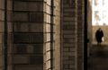
Giles: Grandmaby kevrobertsonComment by jonfrommk: ooooo you are going to suffer with a lot of people who will not understand the reference point of this title. I have to say I oved his cartoons and this just made me laugh out loud
Good job and nicely blended with an original and intriguing photo - 7 |
| Photographer found comment helpful. |
| 11/12/2007 01:29:01 AM |
|
| Photographer found comment helpful. |
| 10/22/2007 07:20:52 PM |
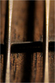
Fretby kevrobertsonComment by jeger: I like the lighting and the focus. The composition is very symmetrical, and a different angle might produce a little more variety and interest. |
| Photographer found comment helpful. |
| 10/22/2007 06:31:40 PM |
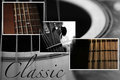
classic-web.jpgby kevrobertsonComment by Beetle: I'm seeing good and bad here.
I like the overall composition, the diagonal, the mix between color and b&w, the individual photos and the whole theme.
What I don't like is what you've done on the half hearted thing you did to the overlapping frames - you sort of (but not really) erased the frames at those points.
I think you need to make up your mind which way to go - either leave them and play with the way they are layered/staggered, or merge/erase those corners properly. |
| Photographer found comment helpful. |
| 10/22/2007 05:10:00 PM |
classic-web.jpgby kevrobertsonComment by Art Roflmao: Now this is a nice arrangment - the type of thing the other shot might have fit, but in thinking about it the other one was too tight/close as to even tel what it is.
This is good though. |
| Photographer found comment helpful. |
| 10/22/2007 05:08:22 PM |
Fretby kevrobertsonComment by Art Roflmao: no comment. :P j/k
Technically it is very good I think. Aesthetically, the colors are nice. Compositionally though - same comment as others and yourself. Lacks interest - maybe a different angle or something. A 5.1 from me so as not to surprise or disappoint. :) |
| Photographer found comment helpful. |
| 10/22/2007 04:52:38 PM |
Fretby kevrobertsonComment by rox_rox: I can't believe you didn't get ANY comments! Shame on us.
I didn't vote on this challenge, but I'd probably have given it a 5 or 6.
The rich tones and sharpness are nice, but I find myself longing for more to look at. Does that make sense? The extremely shallow DOF leads the eye to a spot, but there isn't a whole lot to see there. Where's  jutilda jutildawhen you need her? She always says these things so much better.
I also think the composition might be more interesting if it were somehow less symmetrical and straight-on. I'm sure you wanted to break away from the same-old rule of thirds thing, but in this case I feel it might have helped.
Overall, a fine image and surely deserving of some comments. |
| Photographer found comment helpful. |
| 10/22/2007 04:49:20 PM |
Fretby kevrobertsonComment by violinist123: You are quite the apt score predictor!
Very nice detail in the little sliver of the image that is in focus. one of the big challenges with macro photography is using an aperture that gets as much of your subject in focus as you want/need to make for an interesting photo. That usually means going with a very narrow aperture, which in turn requires buckets and buckets of light so that you can properly expose the shot.
Not a lot going on in this shot, but were more of it in focus and if it were shot from a different angle, it might have been a bit more interesting.
Good luck. |
| Photographer found comment helpful. |
Home -
Challenges -
Community -
League -
Photos -
Cameras -
Lenses -
Learn -
Help -
Terms of Use -
Privacy -
Top ^
DPChallenge, and website content and design, Copyright © 2001-2026 Challenging Technologies, LLC.
All digital photo copyrights belong to the photographers and may not be used without permission.
Current Server Time: 07/16/2026 06:37:33 AM EDT.