| Author | Thread |
|
|
10/22/2007 06:31:40 PM |
I'm seeing good and bad here.
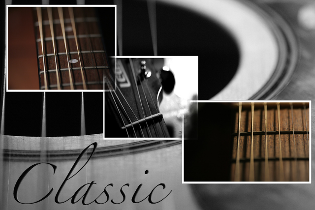
I like the overall composition, the diagonal, the mix between color and b&w, the individual photos and the whole theme.
What I don't like is what you've done on the half hearted thing you did to the overlapping frames - you sort of (but not really) erased the frames at those points.
I think you need to make up your mind which way to go - either leave them and play with the way they are layered/staggered, or merge/erase those corners properly. |
|
 Photographer found comment helpful. Photographer found comment helpful. |
|
|
10/22/2007 05:10:00 PM |
Now this is a nice arrangment - the type of thing the other shot might have fit, but in thinking about it the other one was too tight/close as to even tel what it is.
This is good though. |
|
| Photographer found comment helpful. |
Home -
Challenges -
Community -
League -
Photos -
Cameras -
Lenses -
Learn -
Help -
Terms of Use -
Privacy -
Top ^
DPChallenge, and website content and design, Copyright © 2001-2026 Challenging Technologies, LLC.
All digital photo copyrights belong to the photographers and may not be used without permission.
Current Server Time: 06/12/2026 03:05:13 PM EDT.