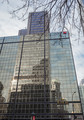
Illusionby
clickodakComment by Lydia: Greetings from the Critique Club, Marcel!
The reflections you've seen and captured here are amazing! I've enjoyed exploring all of them.
I think your score on this image is lower than others of yours this year because of the focus issues. The top, where the viewer starts is out of focus, so we wait as we search to find the "subject" of your image.
When we get to the end and find that we've been exploring the subject all along... it's disappointing a bit.
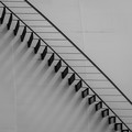
Compare this image to your stairs illusion image. That image is totally in focus and holds the viewer's attention the entire image.
This image seems a bit dull in the colors and... really has no "punch" to it. The goodness of the lower portion sneaks up and never gives the "oh wow" that it would if the upper portion were cropped out and the viewer came into the image in the in-focus part... and was submersed immediately into the wonderful reflections you've captured.
If this image were mine, I'd crop off the top (making it square), pump up the contrast and saturation, and watch the score climb.
I can't wait to see what you enter next!