| Image |
Comment |
| 09/01/2014 09:47:13 PM |
|
 Photographer found comment helpful. Photographer found comment helpful. |
| 09/01/2014 07:54:16 PM |
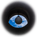
light-eyeby clickodakComment by sfalice: Greetings from the Critique Club
 clickodak clickodak! I get to look at one of your images in depth again! Delightful!
Your powers of observation are magical. To see something like this is a gift. Hang on to that gift.
Now, personally I liked the image alot. For the Challenge, I was bothered a bit by the white outline.
Frankly, I think that black border (eliminating the white) would have met the Challenge equally as well, and perhaps would have scored better.
Technically, nothing wrong with this image - or at least that I can tell.
I do like your sense of originality, in all your Challenge submissions.
|
| Photographer found comment helpful. |
| 09/01/2014 01:17:20 PM |
|
| Photographer found comment helpful. |
| 09/01/2014 01:30:11 AM |
|
| Photographer found comment helpful. |
| 08/31/2014 10:04:19 AM |
|
| Photographer found comment helpful. |
| 08/30/2014 02:57:09 PM |
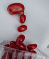
Tomatoes factoryby clickodakComment by cowboy221977: Hello from the critique club.
Interesting take on the surrealism challenge. I enjoy the simplistic approach you took with this. The DOF is good and the colors are good. Overall nice shot...Good job |
| Photographer found comment helpful. |
| 08/28/2014 10:46:13 AM |
|
| Photographer found comment helpful. |
| 08/28/2014 10:11:06 AM |
Tomatoes factoryby clickodakComment by jgirl57: Already voted-
These tomatoes are really good.. the creativity you used for it turned out.. love the rich detailed color and lighting on this |
| Photographer found comment helpful. |
| 08/27/2014 02:36:27 AM |
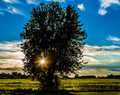
Abandoned in the middle of nowhereby clickodakComment by wbanning: Hi Marcel,
I'm new to the Critique Club and this photo came up as one of the first for my critique.
This is a bold and dramatic image. Shooting directly into the light with the placement of the sun/sunburst behind the tree creates a striking center of attention. It also defines a very difficult lighting tableau to photograph effectively. I think you've attempted to address the challenging light with HDR processing.
For my taste, the overall intensity of the processing is too extreme and creates several competing elements that seem to be vying for attention. For example, the deep blue sky at the top of the frame accentuates the HDR halo effect behind the tree. There is also a dramatic color temperature shift from the deep cool blues at top of the sky to the golden warmth of the clouds on the horizon and the crop directly behind the tree, which feels quite unnatural to me. While there are several interesting aspects to the scene, I just can't seem to grasp it as a whole, cohesive image.
A note about the composition - You've placed the sun almost exactly at the lower left intersection of traditional "rule of thirds" lines. I think that combining the brightest area of the image with this powerful compositional positioning tends to bring the viewer's eye to rest directly on the sunburst and places great weight on the lower left corner of the image.
All that said, I understand that your intent may have been to express the intense drama and variety of light throughout the scene - you've certainly done that. It's full of color and passion. Personally, I find the warm yellow-green color and highlights of the crop growing behind the tree to be among the most attractive part of the scene. When taken as a single isolated component of the photo, I think it's a very pleasing bit of processing.
|
| Photographer found comment helpful. |
| 08/27/2014 12:12:02 AM |
Mixedby clickodakComment by sfalice: GREETINGS FROM THE CRITIQUE CLUB
Hello [user]clickodat[/user]! By the luck of the draw, I get one of your images again to critique.
Now, I don't know why you didn't get a better score for this very good image.
It is clean, sharp and certainly has enough purple in it to qualify for the Challenge.
Perhaps it is because you did not use more of the space available, or perhaps voters saw the purple
as secondary, rather than the primary focus of the image.
Frankly, I think it is a strong & original image and it should have done better in the Challenge. Keep 'em coming. |
| Photographer found comment helpful. |
Home -
Challenges -
Community -
League -
Photos -
Cameras -
Lenses -
Learn -
Help -
Terms of Use -
Privacy -
Top ^
DPChallenge, and website content and design, Copyright © 2001-2026 Challenging Technologies, LLC.
All digital photo copyrights belong to the photographers and may not be used without permission.
Current Server Time: 07/17/2026 03:22:59 AM EDT.