| Image |
Comment |
| 08/02/2004 10:58:33 PM |
Barryby redmoonComment by tfaust: Nice macro, you captured some good detail in the buttefly. This shot is a bit overexposed though. |
| 08/02/2004 05:45:00 PM |
|
| 08/02/2004 01:58:28 PM |
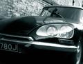
Carby redmoonComment by zagreus: This looks very classy in black and white and I like the texture of the wall too. Looks like a sweet ride. |
| 08/02/2004 11:14:11 AM |
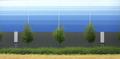
The Faceless Banality of the Industrial Parkby redmoonComment by pcody: Nice find. This is a perfect place to photograph. This picture looks a bit soft and the color is flat. Perhaps a reshoot at a different time of day with the camera on a tripod and a closed down(at least f11) apeture would help provide the details that are missing in this photo. I'd for sure go retake it, if it was my picture. |
| 08/02/2004 02:58:07 AM |
full / emptyby redmoonComment by Spanish_Grease: I was just wondering how you lit this, you did a wonderful job of it!
Would you mind sending me a PM when you read this?
Thanks!
Lee |
| 08/02/2004 12:53:36 AM |
Barryby redmoonComment by photom: Excellent specimen but terrible lighting. The bright green at the top really detracts, as do the other bight areas. |
| 08/01/2004 10:14:44 PM |
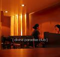
Divine Paradise Clubby redmoonComment by arnit: Finally a good cover. Like this font very much. And the brackets are cool. The only thing that bothers me is the far left side of the picture. Think you should crop just a few pixels from the left side. Good composition and I like the movement and the laughter. Excellent job! |
 Photographer found comment helpful. Photographer found comment helpful. |
| 08/01/2004 10:13:01 AM |
Divine Paradise Clubby redmoonComment by dinn: Wonderful warm tone, just like a shot in a magazine with a simple text. Also like a people in this shot. Good luck. |
| Photographer found comment helpful. |
| 08/01/2004 05:42:16 AM |
|
| Photographer found comment helpful. |
| 07/30/2004 01:18:28 PM |
Divine Paradise Clubby redmoonComment by bpickard: really like the overall red hue and lettering. I think a higher point of view would have worked better...the table is too prominent at the bottom (but I guess you were taking a candid photo and wanted to stay incognito). Also the motion blurring is a bit distracting |
| Photographer found comment helpful. |
Home -
Challenges -
Community -
League -
Photos -
Cameras -
Lenses -
Learn -
Help -
Terms of Use -
Privacy -
Top ^
DPChallenge, and website content and design, Copyright © 2001-2026 Challenging Technologies, LLC.
All digital photo copyrights belong to the photographers and may not be used without permission.
Current Server Time: 07/15/2026 03:01:22 PM EDT.