| Image |
Comment |
| 05/17/2004 02:39:45 AM |
|
 Photographer found comment helpful. Photographer found comment helpful. |
| 05/16/2004 08:23:50 AM |
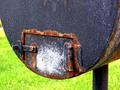
P5100124_small.jpgby drgsoellComment by pcody: The colors are striking! I think the green of the grass goes with the rust. I aggree with cropping out the white area on the left. Excellent detail. |
| 05/16/2004 07:45:33 AM |
|
| Photographer found comment helpful. |
| 05/15/2004 11:36:49 PM |
P5100124_small.jpgby drgsoellComment by Neil: This has a lot going for it as a natural abstract. I like the combination of colors, and the sweeping shap of the object. The only thing I think I would do is to either crop the left to get rid of the bright spot that's different than the grassy background, or outside of a challenge you could clone it out (completing the green)
I would have given this a very good score. |
| 05/15/2004 11:18:18 PM |
P5100124_small.jpgby drgsoellComment by suemack: I think this is a really interesting rust pic. I like the colours on the letterbox though the lighting on it seems a little flat to me too. With the darker green grass this pic would have probably done quite well in the challenge. Very good beginning.
sue |
| 05/15/2004 11:09:09 PM |
P5100124_small.jpgby drgsoellComment by goinskiing: Actually, I like this shot a lot. The focus is stellar and the subject very definite. I would play with the levels a little bit to darken up the green background in the shot, because the the green really pops out a little more than it should, but this is just a minor technicality. Also, the lighting is just a tad flat, but I think that could be adjusted with levels and contrast, but again, minor technicality. Also, I think I would also crop just a little bit off the top to help the balance a bit. For a 9-year-old, this is an excellent start (much better than my first). I actuallyu think it would have faired quite well in the rusted challenge. Tell her good job and good luck for the future! |
| 05/15/2004 04:52:14 PM |
|
| Photographer found comment helpful. |
| 05/14/2004 04:36:14 PM |
Charged Oppositesby drgsoellComment by sadrzy: The "opposites" concept is obvious - that's good. I don't understand why the set in the background is included given that the set in the foreground is in better focus and conveys the same message. Perhaps you might have extend the series (include more battery pairs) or reduced it to a single set. |
| Photographer found comment helpful. |
| 05/14/2004 10:21:18 AM |
|
| Photographer found comment helpful. |
| 05/13/2004 10:56:46 PM |
Charged Oppositesby drgsoellComment by dsa157: good idea for a macro shot, but I think you should have come in even tighter (or just cropped tighter) The batteries are just floating within the whitespace above and below them. The whitespace is not complementary to the subject in this case. |
| Photographer found comment helpful. |
Home -
Challenges -
Community -
League -
Photos -
Cameras -
Lenses -
Learn -
Help -
Terms of Use -
Privacy -
Top ^
DPChallenge, and website content and design, Copyright © 2001-2026 Challenging Technologies, LLC.
All digital photo copyrights belong to the photographers and may not be used without permission.
Current Server Time: 06/12/2026 12:32:25 PM EDT.