| Author | Thread |
|
|
05/16/2004 08:23:50 AM |
|
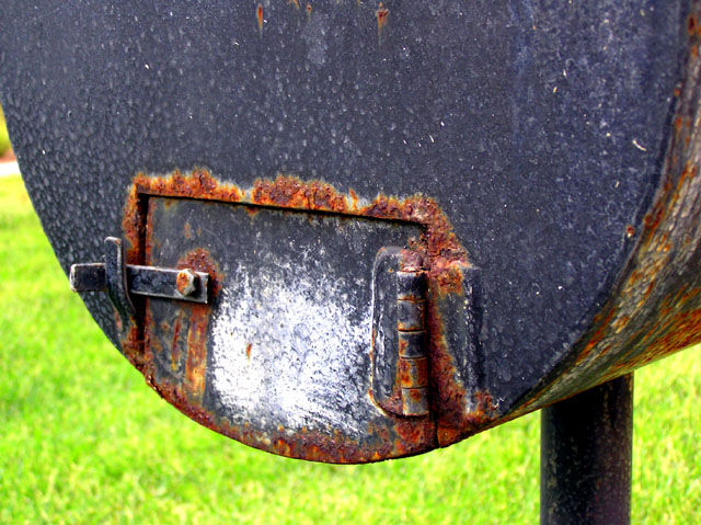
The colors are striking! I think the green of the grass goes with the rust. I aggree with cropping out the white area on the left. Excellent detail. |
|
|
|
05/15/2004 11:36:49 PM |
This has a lot going for it as a natural abstract. I like the combination of colors, and the sweeping shap of the object. The only thing I think I would do is to either crop the left to get rid of the bright spot that's different than the grassy background, or outside of a challenge you could clone it out (completing the green)
I would have given this a very good score. |
|
|
|
05/15/2004 11:18:18 PM |
I think this is a really interesting rust pic. I like the colours on the letterbox though the lighting on it seems a little flat to me too. With the darker green grass this pic would have probably done quite well in the challenge. Very good beginning.
sue |
|
|
|
05/15/2004 11:09:09 PM |
|
Actually, I like this shot a lot. The focus is stellar and the subject very definite. I would play with the levels a little bit to darken up the green background in the shot, because the the green really pops out a little more than it should, but this is just a minor technicality. Also, the lighting is just a tad flat, but I think that could be adjusted with levels and contrast, but again, minor technicality. Also, I think I would also crop just a little bit off the top to help the balance a bit. For a 9-year-old, this is an excellent start (much better than my first). I actuallyu think it would have faired quite well in the rusted challenge. Tell her good job and good luck for the future! |
|
Home -
Challenges -
Community -
League -
Photos -
Cameras -
Lenses -
Learn -
Help -
Terms of Use -
Privacy -
Top ^
DPChallenge, and website content and design, Copyright © 2001-2026 Challenging Technologies, LLC.
All digital photo copyrights belong to the photographers and may not be used without permission.
Current Server Time: 07/23/2026 07:42:35 AM EDT.