| Image |
Comment |
| 01/01/2003 08:47:20 PM |
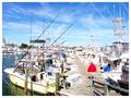
Harborby GraciousComment by PTLParsons: Too bright. All the white on the boats is blown out. Nice depth and good focus. A very tight shot making it look busy. Either darken or lower the contrast on this. Reducing the gamma might help. It's worth a try. PTL 5 |
| 01/01/2003 12:07:16 PM |
|
| 01/01/2003 09:58:52 AM |
|
| 12/31/2002 05:54:25 PM |
Goo Goo Dollby GraciousComment by HBunch: I don't like this much at all. There is really no detail to honor this person with. She looks like a lovely girl, why not show that off? I can't comment on technical aspects like focus or lighting, cause there really isn't any due to so much post processing. The angle and framing/cropping needs some work though, in my opinion. You cut her nose right off. Sorry if I don't see this the way you do. Good luck in the challenge. |
| 12/31/2002 02:56:09 PM |
Goo Goo Dollby GraciousComment by myqyl: You have a nice composition here, but for my tastes, you went too far with the post processing. I can see the value in it, but it just doesn't work for me... |
| 12/31/2002 08:28:52 AM |
|
| 12/31/2002 05:10:20 AM |
Goo Goo Dollby GraciousComment by LindaLee: Very interesting "art type" portrait, that does manage to capture some expressiveness. The composition feels a little unbalanced to me, with just a little too much negative space for my taste. Overall though, I like the photo. |
| 12/31/2002 02:50:22 AM |
Harborby GraciousComment by vestanpance: Looks bright and oversaturated (especially the distant boats). Nice colour and detail though. |
| 12/30/2002 11:00:05 PM |
|
| 12/30/2002 09:04:40 PM |
Harborby GraciousComment by Lustre: Nice photo, although a little to much glare. Perhaps a polarising filter would help (unless you already had one on?). Nice framing though. |
Home -
Challenges -
Community -
League -
Photos -
Cameras -
Lenses -
Learn -
Help -
Terms of Use -
Privacy -
Top ^
DPChallenge, and website content and design, Copyright © 2001-2026 Challenging Technologies, LLC.
All digital photo copyrights belong to the photographers and may not be used without permission.
Current Server Time: 07/18/2026 02:42:02 AM EDT.