DPChallenge: A Digital Photography Contest You are not logged in. (log in or register
 
Browse Settings
Currently viewing:
Registered UserGracious

Show comments:

Per page:

Order:

Comments:


Comments Received by Gracious
Pages:   ... [116] [117] [118] [119] [120] [121] [122] ... [205]
Showing 1181 - 1190 of ~2045
Image Comment
Untitled
03/25/2003 10:20:29 PM
Untitled
by Gracious

Comment by robbieh:
Neat idea.
Photographer found comment helpful.
Untitled
03/25/2003 10:11:13 PM
Untitled
by Gracious

Comment by schurg:
kinda disturbing...I like it
Photographer found comment helpful.
Untitled
03/25/2003 01:37:08 PM
Untitled
by Gracious

Comment by Chuckie:
nice photo good idea.
Photographer found comment helpful.
Untitled
03/25/2003 11:20:14 AM
Untitled
by Gracious

Comment by juseyhota:
good use of past articles but the egg timer has been used a lot
Whisk Bouquet
03/25/2003 08:39:38 AM
Whisk Bouquet
by Gracious

Comment by emorgan49:
I like to search out my 9s and 10s to see where they place - this one should have done much better, it is lovely.
Whisk Bouquet
03/25/2003 05:04:50 AM
Whisk Bouquet
by Gracious

Comment by inspzil:
Greetings from the Critique Club
By Inspzil

Composition - This sort of reminds me of a flower macro. Its a good idea. I think it definitely meets the challenge. In terms of composition, there are a couple things that come to mind right away that catch my attention. The framing seems sort of crowded. What I think for this image is that the "flower" should start further to the left and open up to the wider side. In this photo, it starts about center and crowds the right side of the photo. Also they seem to be pointing a little down from vertical where I think they would look better pointing up a little. I think a lot of my varying ideas of perception regarding this shot are going under the assumption that this is simulating a blossom. As always with my CC stuff, take what you think is viable and ditch the rest :)

Technical - Well lit and well exposed. Focus is pretty good but it looks a little oversharpened to me. It looks like it might be a little grainy too which would be a distinct side effect of being oversharpened. The other processing looks pretty good.

Overall - Well conceived. There are a couple things I tweak in this image regarding the framing of this photo. I really like the light and the yellow color. Hope this could be of some help to you. Good luck in future challenges. - Inspzil
Rescued from The Shelter and So Happy She Can't stop Wagging!
03/24/2003 11:29:53 PM
Rescued from The Shelter and So Happy She Can't stop Wagging!
by Gracious

Comment by DennisF:
Cute. Wish the eyes had some highlights.
Photographer found comment helpful.
Untitled
03/24/2003 05:55:50 PM
Untitled
by Gracious

Comment by Jeileen:
Titles are important - they help me to understand what you are trying to show....
Photographer found comment helpful.
Finito
03/24/2003 05:41:43 PM
Finito
by Gracious

Comment by mbardeen:
Greetings from the Critique Club!
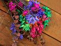
Initial reaction:
Pretty, vibrant colors. Unique but ultimately not effective composition. Fails to hold my eye.

Challenge:
Meets the challenge fine, since it's fairly obvious that it's shot from above.

Composition:
This is where my strongest criticism lies. You have this shot at an interesting angle - the diagonals of the board carry throughout the entire picture. However, the placement of the flowers so that they follow the planks of wood detracts from their impact. A really simple way to increase the visual excitement of your picture would be to position the flowers differently. For example, laying them perpendicular to the main diagonals would provide contrast and more excitement to your composition.

The grain of the wood provides a nice texture to offset the flowers. This is good and I like it, but there isn't enough of it for my taste. I'm a big fan of using negative space to really enhance a subject, and this would have been a great opportunity to do just that. This would have given you the chance for a more exciting position of the flowers within the frame as well. Right now they dominate and don't leave anywhere for they eye to travel. With more negative space you'd have the grain, color, and lines of the wood dominating the picture, then you'd have the splash of color with the flowers.

Post-Processing:
The colors are rich and vibrant, they almost pop out of the picture! They give the flowers an almost surreal quality which I like.

Overall:
Good, but not great - mostly due to the composition.

Hope this helps! Feel free to contact me with any questions you have.
Matt
Photographer found comment helpful.
Untitled
03/24/2003 03:58:04 PM
Untitled
by Gracious

Comment by one66stang:
This fits with the currnet world happening and the hour glass adds the time part . I would have postioned the hour glass different so we couldnt see the nail on the bottom
Photographer found comment helpful.
Pages:   ... [116] [117] [118] [119] [120] [121] [122] ... [205]
Showing 1181 - 1190 of ~2045


Home - Challenges - Community - League - Photos - Cameras - Lenses - Learn - Help - Terms of Use - Privacy - Top ^
DPChallenge, and website content and design, Copyright © 2001-2025 Challenging Technologies, LLC.
All digital photo copyrights belong to the photographers and may not be used without permission.
Current Server Time: 09/12/2025 04:45:21 AM EDT.