| Author | Thread |
|
|
03/24/2003 05:41:43 PM |
Greetings from the Critique Club!
Initial reaction:
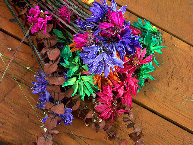
Pretty, vibrant colors. Unique but ultimately not effective composition. Fails to hold my eye.
Challenge:
Meets the challenge fine, since it's fairly obvious that it's shot from above.
Composition:
This is where my strongest criticism lies. You have this shot at an interesting angle - the diagonals of the board carry throughout the entire picture. However, the placement of the flowers so that they follow the planks of wood detracts from their impact. A really simple way to increase the visual excitement of your picture would be to position the flowers differently. For example, laying them perpendicular to the main diagonals would provide contrast and more excitement to your composition.
The grain of the wood provides a nice texture to offset the flowers. This is good and I like it, but there isn't enough of it for my taste. I'm a big fan of using negative space to really enhance a subject, and this would have been a great opportunity to do just that. This would have given you the chance for a more exciting position of the flowers within the frame as well. Right now they dominate and don't leave anywhere for they eye to travel. With more negative space you'd have the grain, color, and lines of the wood dominating the picture, then you'd have the splash of color with the flowers.
Post-Processing:
The colors are rich and vibrant, they almost pop out of the picture! They give the flowers an almost surreal quality which I like.
Overall:
Good, but not great - mostly due to the composition.
Hope this helps! Feel free to contact me with any questions you have.
Matt
|
|
 Photographer found comment helpful. Photographer found comment helpful. |
Comments Made During the Challenge  |
|
|
03/23/2003 11:07:38 PM |
|
Very strong color saturation! Composition works well, in my opinion. |
|
| Photographer found comment helpful. |
|
|
03/23/2003 05:10:52 PM |
|
The odd perspective and composition really works here with the flowers coming DOWN from the top rather than from the bottom. Nice colors, too. |
|
| Photographer found comment helpful. |
|
|
03/21/2003 02:00:58 PM |
|
| Photographer found comment helpful. |
|
|
03/21/2003 12:28:05 PM |
|
| Photographer found comment helpful. |
|
|
03/21/2003 09:53:19 AM |
|
| Photographer found comment helpful. |
|
|
03/20/2003 05:58:17 PM |
|
That's too bad. Lovely colored flowers, nice photo, good dof, great lighting. |
|
| Photographer found comment helpful. |
|
|
03/20/2003 05:25:22 AM |
|
This a fantastic shot. i love the colors. It is so sharp and crisp |
|
| Photographer found comment helpful. |
|
|
03/19/2003 07:40:56 AM |
|
With the flowers so centrally framed it's a little less of an image than I think it might have been. Colours a great though - on the boards as well as the flowers. |
|
| Photographer found comment helpful. |
|
|
03/19/2003 01:56:40 AM |
|
| Photographer found comment helpful. |
|
|
03/18/2003 02:28:25 PM |
|
nice use of color and i like the wood behind it. |
|
| Photographer found comment helpful. |
|
|
03/18/2003 06:23:23 AM |
|
the flowers are not together as unity so the theme isn't not cerried out, IMO. It should be composed. |
|
| Photographer found comment helpful. |
|
|
03/17/2003 09:06:49 AM |
|
Great colors! Is it enhanced a little? Beautiful natural shot! |
|
| Photographer found comment helpful. |
|
|
03/17/2003 08:39:33 AM |
|
very nice color... I like the strong diagonals of the woodwork also... nice shot :) - setzler |
|
| Photographer found comment helpful. |
Home -
Challenges -
Community -
League -
Photos -
Cameras -
Lenses -
Learn -
Help -
Terms of Use -
Privacy -
Top ^
DPChallenge, and website content and design, Copyright © 2001-2026 Challenging Technologies, LLC.
All digital photo copyrights belong to the photographers and may not be used without permission.
Current Server Time: 06/28/2026 01:03:04 AM EDT.