| Image |
Comment |
| 01/03/2005 04:38:08 PM |
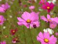
Roadside Wildflowerby wkmenComment by Jinjit: This one is beautiful!
I love your DOF and the details on the sharp flowers in the foreground.
I think your composition is wonderful regarding the flowers you chose to have in focus.
Just a tiny thing I would change: my eye is drawn to the dark point to the right of the centered flower. It looks like a close flower or something like that, but I feel it's a little bit distructing.
You can try dodging it a bit or just lighten it's colors a tiny bit, to make it closer to the light pink of the rest of the flowers.
Other then that I think this is one of your best! It is so cheerful and sunny |
 Photographer found comment helpful. Photographer found comment helpful. |
| 01/03/2005 04:35:02 PM |
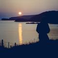
solitary sunsetby wkmenComment by gloda: This one's not to my liking. I think the dark parts should be black and not gray, or at least show some more details. The sunset is not red enough to have a strong effect. You might either try to push the saturation, or turn the whole picture b&w.
The picture is quite noisy, too. I think you could run it through NeatImage without losing too much overall quality. |
| Photographer found comment helpful. |
| 01/03/2005 04:31:30 PM |
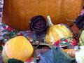
summer is doneby wkmenComment by gloda: Cool picture, it's mainly the powerful colours which draw my attention. You might have chosen a different crop, the limit between the pumpkin and the rest of the table is too close to the horizontal center of the image. Apply some rules of thirds to make the picture more harmonic. The two things (pumpkins?) at the lower-right are out of focus. They are distracting from the rest of the image.
Edit: I appreciate the choice of the title. Much better than 'autumn' :) Message edited by author 2005-01-03 16:32:10. |
| Photographer found comment helpful. |
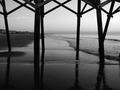
| 01/03/2005 04:30:12 PM |
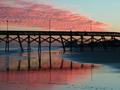
pier at sunsetby wkmenComment by Jinjit: I like this one very much. I love the imperfections of the logs, the reflections and the interesting shapes of the logs as well as of the clouds.
Something in the colors does seem a little bit dull though. Maybe it is just my monitor screen but you can try playing just a little bit with the contrast. Maybe it will give the colors the needed boost |
| Photographer found comment helpful. |
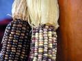
| 01/03/2005 04:28:39 PM |
a touch of autumnby wkmenComment by gloda: This one's really cool. I love the random pattern on the corns, I like how the dark one is in contrast to the bright one, and how they blend at the top because of their similar leafs. I also like how the blue background at the left opposes the orange pumpkin (?) at the right.
The only thing I see that could be improved on is that the blue background at the left doesn't go all the way down. |
| Photographer found comment helpful. |
| 01/03/2005 04:25:21 PM |
Roadside Wildflowerby wkmenComment by gloda: I don't like this one as much as the others. The pink and the green don't go together for me. I also think that the many small petals in the background are distracting. I don't know what to focus on.
I have to admit though that the shallow DOF is well chosen. It blurs the distracting background and diminishes it's effect. Yet, three flowers in focus are two too many.
You made a good use of the USM, I like the crispness of the central flower's petal. |
| Photographer found comment helpful. |
| 01/03/2005 04:21:41 PM |
At the Car Showby wkmenComment by gloda: I like the sharpness of this one. The details on the car come out well. The reflection on the left side is a bit distracting. I don't know what you could do about it, maybe change the hue on specific areas to blend the red better?
The reflections in the chrome on the car's front however look really cool. They show you something that actually has been cropped away. That's a nice effect.
The thing I like most is the out-of-focus-flower in the foreground. It adds a lot to the picture, introduces some new colours and fills the empty space in the upper-left corner.
I'd have liked to see all of the car's right front though. I understand why you had to crop it away, but it's a pity you had to cut the car 'to pieces'. |
| Photographer found comment helpful. |
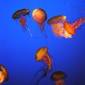
| 01/03/2005 04:20:52 PM |
Jellyfish Balletby wkmenComment by Jinjit: I know this one was not under "comments please" category of your portfolio, but I couldn't resist :-)
I love jely fish. I think they are one of the most amazing creatures upon this earth!
This pictuere is beautiful!
I think it is too much neatImaged, because you lost too many details of the jellyfish's arms, but the lighting and the big blue space makes it all so wonderful I can simply start to float with them and forget all about neatImage... |
| Photographer found comment helpful. |
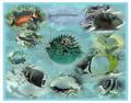
| 01/03/2005 04:17:28 PM |
Undersea Montage #2.jpgby wkmenComment by gloda: Nice artwork. It would do well as desktop wallpaper, although it's a bit too distracting for that. I like the blue cast, it gives the pictures the right 'underwater' feeling.
As you said, the picture is too circular. Try to move them around a little bit, make their place in the image look random.
You might also want to use a softer eraser. The gradient between the background an the single fishes with their respective background is too harsh.
Oh, and those pictures are awesome. I like how colourful they are. |
| Photographer found comment helpful. |
| 01/03/2005 04:17:25 PM |
pier reflectionsby wkmenComment by Jinjit: this one I love!
I would probably clone out the little string hanged from the bridge on the right side, but other then that I wouldn't change a thing.
I like the mood, and coolness, the grain ...
I find this one to be very uniqe and artistic. |
| Photographer found comment helpful. |
Home -
Challenges -
Community -
League -
Photos -
Cameras -
Lenses -
Learn -
Help -
Terms of Use -
Privacy -
Top ^
DPChallenge, and website content and design, Copyright © 2001-2026 Challenging Technologies, LLC.
All digital photo copyrights belong to the photographers and may not be used without permission.
Current Server Time: 07/16/2026 03:51:10 AM EDT.