| Image |
Comment |
| 10/20/2003 02:09:50 AM |
|
 Photographer found comment helpful. Photographer found comment helpful. |
| 10/20/2003 12:01:52 AM |
|
| Photographer found comment helpful. |
| 10/19/2003 07:13:08 PM |
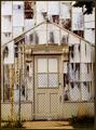
Repairs neededby pcodyComment by Imagineer: I really like this shot for originality and execution. It presents the subject matter in a nicely designed way with the messy decor creating the textural interest in the shot. Nice composition. [8] |
| Photographer found comment helpful. |
| 10/17/2003 10:39:45 AM |
Redirectionby pcodyComment by jboling: very imaginative. I seem to have lost my imagination and wish I'd thought it through as well as you did. |
| Photographer found comment helpful. |
| 10/17/2003 09:08:13 AM |
|
| Photographer found comment helpful. |
| 10/17/2003 08:18:12 AM |
Repairs neededby pcodyComment by Neuferland: My initital reaction on this shot is that it's too much, to bright, to white, too exposed! So of course it fits the challenge perfectly! The brightness on this shot works against you for my taste. The balance of light from the top to the bottom is too much. Starting with a 5, will be back to check again before the challenge is over.
I'm back and except for the brightness and the distracting tree in the upper right, I'm raising the score to 7
Hi! One more time, there is something about this shot that keeps me coming back for more. The thumbnail just keeps popping out and calling to me! I think it's the fact that I keep finding new little details everytime I look at it. I like that, keeps me looking. I'm going up another notch to an 8. |
| Photographer found comment helpful. |
| 10/16/2003 09:41:23 AM |
|
| Photographer found comment helpful. |
| 10/15/2003 09:28:11 PM |
Redirectionby pcodyComment by bruski: Interesting idea, but I find the composition lacking a bit. Maybe some different light or a different angle could help out a bit. |
| Photographer found comment helpful. |
| 10/15/2003 09:15:26 PM |
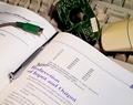
Redirectionby pcodyComment by wip: I think that when putting text within an image you must take into account all of the text that can be read within the photograph. Upon first glance of the words Redirection of Input and Output and then seeing the disassembled mouse there a many layers of meaning within this photograph, but because the viewer is then aloud to read some of the paragraph and can see that it is about something totally different, you then wonder why do you have a parts of mouse on a keyboard. They just don't fit together in this sense. Through a different comopositional set up if you could have somehow had the words in the paragraph out of focus and just the Redirection... in focus this would have been a more compelling image. |
| Photographer found comment helpful. |
| 10/15/2003 08:39:52 PM |
Redirectionby pcodyComment by justine: Blows my mind, that is why I have to pay geeks to do heavy tech work. Glad that you understand it. The shot is clean, in focus and has good light. I'm not too crazy about the composition with the white dead space on the right. Still I don't dislike the shot. |
| Photographer found comment helpful. |
Home -
Challenges -
Community -
League -
Photos -
Cameras -
Lenses -
Learn -
Help -
Terms of Use -
Privacy -
Top ^
DPChallenge, and website content and design, Copyright © 2001-2026 Challenging Technologies, LLC.
All digital photo copyrights belong to the photographers and may not be used without permission.
Current Server Time: 07/16/2026 09:55:37 PM EDT.