| Image |
Comment |
| 12/25/2007 05:52:34 PM |
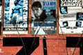
Boxingby BAMartinComment by hanneke: some suggestions of my side:
the risk you take with text in your photo is that you're gonna read it. using a smaller DoF and making the text less easy to read, it wou;ldn't distract as much as it does now. also try to compose the wire at the bottom a bit better, for example one whole wire in the middle, 2 halfs at the side.
if you want to keep the posters the point to focus on, make the wire OOF and maybe try to compose the photo so that the posters are on it full.
the colors in this photo are pretty cool, looks vintage-like. |
 Photographer found comment helpful. Photographer found comment helpful. |
| 12/25/2007 12:45:17 PM |
|
| Photographer found comment helpful. |
| 12/25/2007 03:45:40 AM |
|
| 12/24/2007 06:39:54 PM |
|
| Photographer found comment helpful. |
| 12/24/2007 03:48:22 PM |
|
| Photographer found comment helpful. |
| 12/24/2007 11:14:55 AM |
|
| Photographer found comment helpful. |
| 12/24/2007 02:34:03 AM |
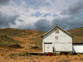
Leading Linesby BAMartinComment by Puckzzz: it looks tilted at first glance. but then the right side seems straight. a little adjusting in perspective would've made it perfect. |
| Photographer found comment helpful. |
| 12/22/2007 06:11:45 PM |
Bottles on a Shelfby BAMartinComment by bleu: I think this is my favorite in your texture series. You really have a great eye for compostion. All the best! |
| Photographer found comment helpful. |
| 12/20/2007 10:47:25 AM |
|
| Photographer found comment helpful. |
| 12/19/2007 11:18:07 AM |
|
| Photographer found comment helpful. |
Home -
Challenges -
Community -
League -
Photos -
Cameras -
Lenses -
Learn -
Help -
Terms of Use -
Privacy -
Top ^
DPChallenge, and website content and design, Copyright © 2001-2026 Challenging Technologies, LLC.
All digital photo copyrights belong to the photographers and may not be used without permission.
Current Server Time: 07/25/2026 09:53:45 PM EDT.