| Author | Thread |
|
|
01/03/2008 01:02:39 PM |
|
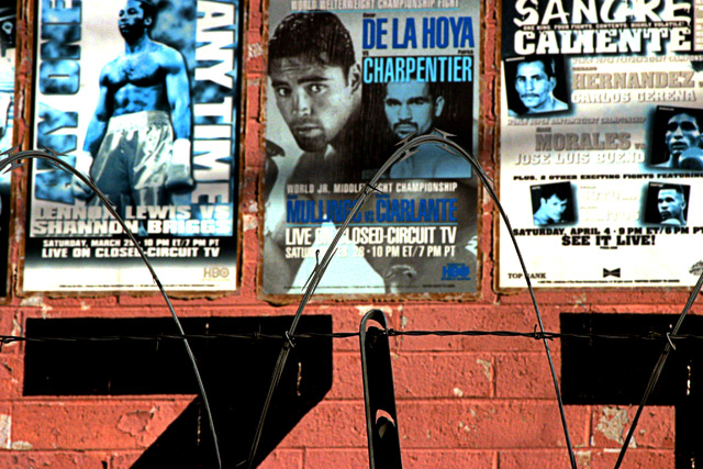
It is intriguing, because it seems so cropped. I wonder about the larger world here, where boxing posters are fenced in by barbed wire. I think I see a huge "Z T" and I wonder what that relates to or is a part of. The composition is pretty well balanced, but there is so little real estate outside of those posters, and the posters are provided almost in full, that I get a strong sense that I am looking at a fragment, not a whole. This is intriguing as I said, but also leaves me wanting more. Sometimes that's a good thing. |
|
 Photographer found comment helpful. Photographer found comment helpful. |
|
|
12/25/2007 05:52:34 PM |
some suggestions of my side:
the risk you take with text in your photo is that you're gonna read it. using a smaller DoF and making the text less easy to read, it wou;ldn't distract as much as it does now. also try to compose the wire at the bottom a bit better, for example one whole wire in the middle, 2 halfs at the side.
if you want to keep the posters the point to focus on, make the wire OOF and maybe try to compose the photo so that the posters are on it full.
the colors in this photo are pretty cool, looks vintage-like. |
|
| Photographer found comment helpful. |
Home -
Challenges -
Community -
League -
Photos -
Cameras -
Lenses -
Learn -
Help -
Terms of Use -
Privacy -
Top ^
DPChallenge, and website content and design, Copyright © 2001-2026 Challenging Technologies, LLC.
All digital photo copyrights belong to the photographers and may not be used without permission.
Current Server Time: 07/21/2026 06:03:19 PM EDT.