| Image |
Comment |
| 01/22/2006 02:54:05 PM |
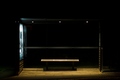
king kongby visaksenComment: King.. Huh?
I assume it's an ad for King Kong on the poster you can barely see?
Nice study in light, not the greatest title IMO |
 Photographer found comment helpful. Photographer found comment helpful. |
| 01/22/2006 02:53:24 PM |
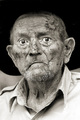
The Generalby jmsetzlerComment: I don't know how many have said it, but your focus really grabbed his chin here, and left the eyes rather soft. Not sure I like that effect. I can see the photographer in them though. Sort of makes it look like he's turning into a snake :) |
| 01/22/2006 02:49:04 PM |
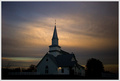
St. John's Lutheranby undieyatchComment: Good work getting light and detail in the church with the sunset in back. A little noisy, which is probably hurting you somewhat. People tend to go ape over the absolute smooth in sunset shots. |
| 01/22/2006 02:48:10 PM |
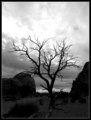
The Tree That Went Upby Marc923Comment: I was going to say that it's a little too dark in the foreground, but maybe that works.. It's kind of confusing though. Like, does this photo want to be a silhouette, or do we want detail in the landscpe, or is it trying to be both? I don't know! :) |
| Photographer found comment helpful. |
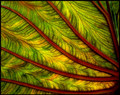
| 01/22/2006 02:46:59 PM |
Lifepulseby taterbugComment: Nice line work here. The darkish 'grungy' (not to be confused with \"grunge\" style), coloring is definitely different. I'm not entirely keen on it, but it works here. The fibrous parts of the leaf almost look alive.. like capillaries. Which, by your title, is probably what you were going for. |
| Photographer found comment helpful. |
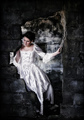
| 01/22/2006 02:43:43 PM |
What if...by heidaComment: Processing is good for this type of photo. This is one photo that really suffers from the 640 pixel limit, as your composition is great, but it leaves the model just a little too small. You could compensate by cropping in closer, but it hurts the comp that way too.
Great tones in the dress and skin, but the wall and far back wall are maybe just a little too heavily worked? Something seems odd there anyway.. loss of texture.. a little too dark/light in areas. Not horribly so, but it's something that distracts me from the model for some reason. |
| Photographer found comment helpful. |
| 01/22/2006 02:40:14 PM |
An Australian Summerby GIS_boyComment: This really does leap out and smack you in the face with the brightness. Not too fond of the coloring myself, natural or not, and the surfer tends to get a little lost. |
| Photographer found comment helpful. |
| 01/22/2006 02:39:22 PM |
Laugh & Be JOYful!by 777STANComment: You really need to utilize the full 640 pixel limit on this site to do well. No matter what your subject or how great a photo, people just do not tolerate small image size entries here. |
| Photographer found comment helpful. |
| 01/22/2006 02:37:27 PM |
Pretty in Pastelsby gerdagriceComment: Contrast and focus are just a little too soft for this to really work. A more diffused light source, with a stronger fall-off would have really helped. By this, I mean getting it to become darker, faster, the deeper into the photo we go. |
| Photographer found comment helpful. |
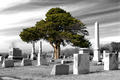
| 01/22/2006 02:34:22 PM |
Life in Deathby DefyTimeComment: I'm a little torn with this.. on one hand, I like what you've seen and are saying, but the desat seems to be just a little strong for me.. and I don't really like the lay-out of the gravestones.. If you'd found an angle where the stones were angled to lead into the tree, it could have been a much stronger compostion. |
Home -
Challenges -
Community -
League -
Photos -
Cameras -
Lenses -
Learn -
Help -
Terms of Use -
Privacy -
Top ^
DPChallenge, and website content and design, Copyright © 2001-2026 Challenging Technologies, LLC.
All digital photo copyrights belong to the photographers and may not be used without permission.
Current Server Time: 07/24/2026 02:24:10 AM EDT.