| Image |
Comment |
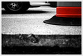
| 06/24/2012 07:27:57 PM |
Surveillance DPby BenstedComment: Brave composition choice. Obscuring the face/eyes is usually a no-no. It sort of works here although the all the muted tones gives it a washed out effect, whihc does not work for me. |
 Photographer found comment helpful. Photographer found comment helpful. |
| 06/24/2012 07:25:57 PM |
|
| Photographer found comment helpful. |
| 06/24/2012 07:20:24 PM |
Stalking Bubblesby CRe8n4uComment: Nice low angle on the shot. Perhaps a square crop would frame kitty with the bubbles and provide more impact. |
| Photographer found comment helpful. |
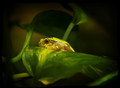
| 06/24/2012 07:16:36 PM |
Prince Charmingby KelliComment: Great color on the frog. I think a tighter crop in the the frog would be a more powerful image. For this challenge topic less DOF as well since the foreground and background are not that far out of focus. |
| Photographer found comment helpful. |
| 06/24/2012 07:12:32 PM |
Sparkling Morningby JuliBocComment: Nicely seen, with great background bokeh. I think crop of just the upper 2/3 is a more pwerful image. The foreground bokeh does not really add to the impact. |
| Photographer found comment helpful. |
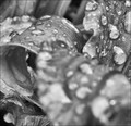
| 06/24/2012 07:08:57 PM |
Kerfuffleby pixelpigComment: Odd in a cool way. The DOF here with the water drops works quite well. Subject matter perhaps a bit mundane to really provide a lot of impact. |
| Photographer found comment helpful. |
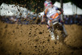
| 06/24/2012 07:07:31 PM |
Gettin' Roostedby rathomasComment: Really cool image. The background bokeh is great as it islotes the rider and the backdrop from the foreground dirt. The foreground bokeh is either missing or incidental to the imapct of the image. Did you lens get clobbered by the dirt? |
| Photographer found comment helpful. |
| 06/24/2012 07:03:36 PM |
Beneathby JamesDowningComment: Intersting composition. The desaturation works well here. I wonder if a differnet angle would have shown off the hole better, as I find it kind of incidental to the image right now. |
| Photographer found comment helpful. |
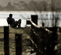
| 06/24/2012 07:01:41 PM |
chilling outby AbraComment: I wish I had this imaage in my portfolio. Great composition. Nice control of the DOF. May be worth trying to clone of the empty chair if you ever print it or submit to other competitions. |
| Photographer found comment helpful. |
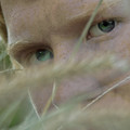
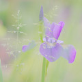
| 06/24/2012 06:59:14 PM |
tall grassby tnunComment: Nice mood here with all the muted tones. I see lots of background bokeh, which is beautiful, but only a small ammount of foreground bokeh which is not that far from being in focus. |
| Photographer found comment helpful. |
Home -
Challenges -
Community -
League -
Photos -
Cameras -
Lenses -
Learn -
Help -
Terms of Use -
Privacy -
Top ^
DPChallenge, and website content and design, Copyright © 2001-2026 Challenging Technologies, LLC.
All digital photo copyrights belong to the photographers and may not be used without permission.
Current Server Time: 06/24/2026 12:45:53 PM EDT.