| Image |
Comment |
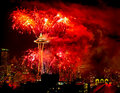
| 01/03/2011 11:58:01 PM |
Big Red Oneby ruel941Comment: Lovely and well executed. Great use of shutter speeed to capture the essense of the firework |
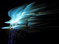
| 01/03/2011 11:57:13 PM |
Bumby OdieComment: I do not get your title here. I like the sweeping lines. Is this natural or rotated I wonder. |
 Photographer found comment helpful. Photographer found comment helpful. |
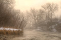
| 01/03/2011 11:55:50 PM |
It Begins With a Bangby Brent_SComment: Great neon look. Perhaps slighly less shutter speed would have darkened the smoke a bit and isolated the trails more. |
| Photographer found comment helpful. |
| 01/03/2011 11:54:39 PM |
|
| Photographer found comment helpful. |
| 01/03/2011 11:53:56 PM |
|
| 01/03/2011 11:52:13 PM |
Simpleby dam8202Comment: This has a really nice composition to it -- bravo. |
| Photographer found comment helpful. |
| 01/03/2011 11:51:35 PM |
Fire Flowersby felipecrpComment: Nicely done. I really like the shutter duration as it leads to some great lines. A little too much smoke at the bottom :( |
| Photographer found comment helpful. |
| 01/03/2011 11:50:58 PM |
|
| Photographer found comment helpful. |
| 12/29/2010 06:02:09 PM |
|
| 12/29/2010 05:59:12 PM |
|
| Photographer found comment helpful. |
Home -
Challenges -
Community -
League -
Photos -
Cameras -
Lenses -
Learn -
Help -
Terms of Use -
Privacy -
Top ^
DPChallenge, and website content and design, Copyright © 2001-2026 Challenging Technologies, LLC.
All digital photo copyrights belong to the photographers and may not be used without permission.
Current Server Time: 07/17/2026 12:25:25 AM EDT.