| Image |
Comment |
| 04/28/2005 11:30:21 AM |
Buddingby prbettsComment: That extremely bright light in the middle is very distracting. Also the picture could have been cropped more on the left. |
 Photographer found comment helpful. Photographer found comment helpful. |
| 04/28/2005 11:28:49 AM |
Forgottenby AranchaComment: The car feels very out of place here. The view should have been from a lower angle or from straight above. The lighting also adds too much glare from the car. |
| Photographer found comment helpful. |
| 04/28/2005 11:27:47 AM |
|
| Photographer found comment helpful. |
| 04/28/2005 11:27:05 AM |
Got... more?by itripnComment: That cherrio must be really lonely. Like that the spoon isn't pristine. |
| Photographer found comment helpful. |
| 04/28/2005 11:24:49 AM |
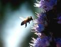
Stingby StangComment: Great texture of the bee, however it feels too centered in the picture. |
| 04/28/2005 11:23:58 AM |
High Stakesby dblinkComment: This would be better if the giant white glare in the middle was not there and some of those light specs were missing. |
| Photographer found comment helpful. |
| 04/28/2005 11:22:39 AM |
Shadow of a Handby theSajComment: Like the use of the brick as a background, but this would be more effective if the image was taken straight down on the brick. The perspective feels awkward with the hand. |
| Photographer found comment helpful. |
| 04/28/2005 11:21:23 AM |
When Less is Moreby DianaBComment: Great use of light, the background is so white and the snail is so clear. Wondering where the snail is going to end up.... |
| Photographer found comment helpful. |
| 04/28/2005 10:41:38 AM |
The natural stoneby lastefComment: Good work with the stone, but the chain seems too out of focus at top. Also the chain is lost a bit too much into the black background. |
| Photographer found comment helpful. |
| 04/28/2005 10:38:14 AM |
Gruenby graphicfunkComment: Good color choice for the watch that you were photographing. However more of the band for the watch should have been shown. |
| Photographer found comment helpful. |
Home -
Challenges -
Community -
League -
Photos -
Cameras -
Lenses -
Learn -
Help -
Terms of Use -
Privacy -
Top ^
DPChallenge, and website content and design, Copyright © 2001-2026 Challenging Technologies, LLC.
All digital photo copyrights belong to the photographers and may not be used without permission.
Current Server Time: 07/16/2026 01:17:49 AM EDT.