| Author | Thread |
Comments Made During the Challenge  |
|
|
05/03/2005 10:02:09 PM |
|
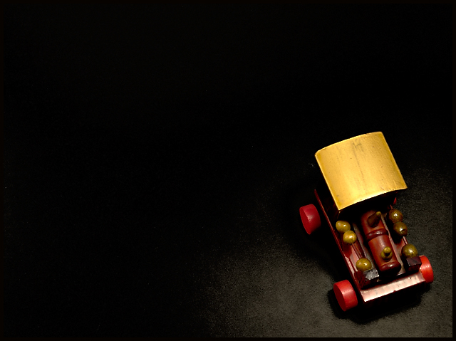
Creative. Great lighting, I like the spotlight effect. The rich wood textures look great. |
|
 Photographer found comment helpful. Photographer found comment helpful. |
|
|
05/03/2005 09:58:19 AM |
|
| Photographer found comment helpful. |
|
|
05/02/2005 10:39:32 PM |
|
I like the colors and lighting on this shot. 8 |
|
| Photographer found comment helpful. |
|
|
05/02/2005 01:57:48 AM |
|
| Photographer found comment helpful. |
|
|
05/02/2005 12:09:09 AM |
|
| Photographer found comment helpful. |
|
|
05/01/2005 05:58:33 PM |
|
| Photographer found comment helpful. |
|
|
05/01/2005 02:14:43 PM |
|
i love the detail and lighting. very simple. 8 |
|
| Photographer found comment helpful. |
|
|
04/30/2005 11:23:40 PM |
|
| Photographer found comment helpful. |
|
|
04/30/2005 01:35:34 PM |
|
The dark area does not add anything. |
|
| Photographer found comment helpful. |
|
|
04/30/2005 06:58:48 AM |
|
| Photographer found comment helpful. |
|
|
04/29/2005 06:46:19 PM |
|
| Photographer found comment helpful. |
|
|
04/29/2005 06:44:52 PM |
|
Good use of lighting to isolate the subject. |
|
| Photographer found comment helpful. |
|
|
04/28/2005 03:29:26 PM |
|
Very moody, good use of negative space. I'm not sure of the positioning of the toy, with it turned towards the outside of the frame instead of inside. The colors are vibrant and crisp, yet feel aged. 8 |
|
| Photographer found comment helpful. |
|
|
04/28/2005 02:19:17 PM |
|
nice soft tones in this picture, good job |
|
| Photographer found comment helpful. |
|
|
04/28/2005 11:28:49 AM |
|
The car feels very out of place here. The view should have been from a lower angle or from straight above. The lighting also adds too much glare from the car. |
|
| Photographer found comment helpful. |
|
|
04/27/2005 10:14:05 PM |
|
| Photographer found comment helpful. |
|
|
04/27/2005 06:15:30 PM |
|
nicely done, nicely done, very creative and fully suits the challenge. top 20, and from me, an 8, well done! |
|
| Photographer found comment helpful. |
|
|
04/27/2005 05:00:30 PM |
|
very good, like the angle |
|
| Photographer found comment helpful. |
|
|
04/27/2005 09:51:02 AM |
|
| Photographer found comment helpful. |
|
|
04/27/2005 08:29:31 AM |
|
love the tones and color in this. it shows that minimalistic doesnt mean monochromatic or an azure background. well done! 9 :o) |
|
| Photographer found comment helpful. |
|
|
04/27/2005 01:44:13 AM |
|
lighting more from side maybe? |
|
| Photographer found comment helpful. |
Home -
Challenges -
Community -
League -
Photos -
Cameras -
Lenses -
Learn -
Help -
Terms of Use -
Privacy -
Top ^
DPChallenge, and website content and design, Copyright © 2001-2026 Challenging Technologies, LLC.
All digital photo copyrights belong to the photographers and may not be used without permission.
Current Server Time: 06/29/2026 01:09:56 AM EDT.