| Image |
Comment |
| 07/26/2003 08:52:21 AM |
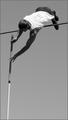
Overby jimmythefishComment: Just a great shot - and the contrast for me is in the opposition of gravity. It's beautifully composed, well captured and really desrves a ribbon, but I wonder if people will assume that it is a bit off-brief. [10] |
 Photographer found comment helpful. Photographer found comment helpful. |
| 07/26/2003 08:51:37 AM |
Contrast courtesy of The Heavensby Firstrich1Comment: Simply stunning capture - what incredible luck to get such positioning! Did you have to crop the image much? This is my10 for the challenge because it just has to beat all the other 'staged' shots. [10] |
| Photographer found comment helpful. |
| 07/26/2003 08:47:22 AM |
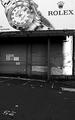
Contrast of Economiesby mzanoniComment: My kind of shot. Very nice. It's a little over sharpened but it's a verys strong concept which could only have been improved by the presence of someone extremely forlorn leaning on the wall. [8] Message edited by author 2003-08-01 12:25:20. |
| Photographer found comment helpful. |
| 07/26/2003 08:43:15 AM |
|
| Photographer found comment helpful. |
| 07/26/2003 08:38:29 AM |
Tuolumneby JPRComment: What a beautiful array of contrasting elements, Propbably not 'contrast' enough for the challenge but it's lovely. It's a little too dark in the foreground. [7] |
| Photographer found comment helpful. |
| 07/26/2003 08:31:05 AM |
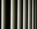
Room Darkeningby jdimaiutaComment: If this had been straightened it would be near perfect. The other thing would be to increase DOF so that the whole shot is in focus - alternatively one end (left) rather than the middle. [7] |
| Photographer found comment helpful. |
| 07/25/2003 05:29:39 PM |
|
| Photographer found comment helpful. |
| 07/25/2003 05:26:51 PM |
Girlhood to Womanhoodby shareinncComment: Your title's a bit misleading here but I suppose you can't get much more contrast than a [female?] teddy and a dildo! Image is too yellow and a bit soft, thus the lower score. [4] |
| 07/25/2003 05:19:59 PM |
Lines and Swirlsby NatashaComment: Intriguing shot. I'd have cropped the bottom of the stem off - makes a cleaner, more dynamic shape. |
| Photographer found comment helpful. |
| 07/25/2003 04:57:05 PM |
Wet 'n Dryby JackoComment: That's my kind of contrast! Image is a bit skewed clockwise which is distracting. Border is also too powerful and spoils the simplicity. |
| Photographer found comment helpful. |
Home -
Challenges -
Community -
League -
Photos -
Cameras -
Lenses -
Learn -
Help -
Terms of Use -
Privacy -
Top ^
DPChallenge, and website content and design, Copyright © 2001-2026 Challenging Technologies, LLC.
All digital photo copyrights belong to the photographers and may not be used without permission.
Current Server Time: 06/16/2026 03:42:15 PM EDT.