| Image |
Comment |
| 08/03/2004 09:47:16 AM |
Freedom of the Seasby davidbedardComment: Great shot with a lovely high-key vibe to it. Slightly skewed horizon is a bit of a bug but it's a very well balanced composition otherwise. |
| 08/03/2004 09:29:18 AM |
High Key Self Portraitby dacrazyrnComment: I like this, although the border really spoils the 'open', 'spacious' vibe that high-key can yield. I'd remove it as you've done a good job here and it would be a shame to mar it in any way. |
 Photographer found comment helpful. Photographer found comment helpful. |
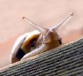
| 08/02/2004 05:08:06 AM |
Leave My Cucumbers Alone!!!by ColeyComment: Beautiful texture and light - the translucency of the eyes is great! Great composition. I like snails so stop moaning about your silly plants!! : ) |
| Photographer found comment helpful. |
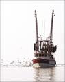
| 07/31/2004 07:04:30 PM |
Red arrowsby marboComment: I have never seen the Red Arrows look so emotive - this is great! |
| Photographer found comment helpful. |
| 07/31/2004 02:03:31 PM |
Dark Punk Colonyby RoosterComment: Nice idea but too washed out. Over exposure's fine but it really needs to have solid black and pure white at both ends of the scale. In this instance you need to reflect some angst so more dominant, heavy contrast would work better. Type is pretty good and nicely layed out. |
| Photographer found comment helpful. |
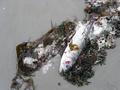
| 07/30/2004 07:54:09 PM |
Nature's Balanceby melismaticaComment: :: Hello from the Critique Club ::
............................................................
As always when shooting for a challenge there is the issue of it obviously meeting the brief for most voters. While I don't think this does per se, it really doesn't take much to come round to some form of link to the balance of nature - even without the title. Its weakness may be that there is not much demonstration of the opposite element of the balance, namely the other part of the food chain - the seagulls.
A short glance at this shot without the benefit of a challenge brief would lead me to think that this is a statement of man's damage to the environment - of something unnatural, such as posinous waters or pollution.
Whatever the view on this it's still an engaging shot, however unpleasant and you were right to retain the colour.
Cheers
Jon |
| Photographer found comment helpful. |
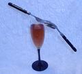
| 07/30/2004 07:47:22 PM |
glass half fullby slingshotComment: :: Hello from the Critique Club ::
............................................................
This is well composed (apart from a tight crop on the right) and it fits the challenge, but it lacks a 'wow factor' beyond those facts, for which there are some clear reasons:
The balancing act is not particularly amazing, and the technical execution lacks some finesse. The colours are slightly old fashioned, reminding me of an old English pub with flocked wallpaper and are quite heavy, yielding an oppressive vibe to the image.
The lighting is harsh and generates many highlights on the glass, and the horizon line is skewed slightly. To aid better lighting on shiney, reflective subjects it is good to aim the light through a diffuser such as a large sheet of paper or a piece of thin cloth. You can also try pointing the light away from the subject and reflecting it back in using a reflector (sometimes the same piece of paper will do) which spreads the point of origin and reduces pinpoint specular highlights.
Yes - this is picking nits, but in order to score highly, so you will have to too!
Personally, I would plan to shoot an image that I would be pleased to hang on my wall after the challenge (I frequently fail in this task myself) but it's something that can help focus one's objectives prior to deciding on a submission.
Cheers
Jon |
| Photographer found comment helpful. |
| 07/29/2004 03:52:01 PM |
Yes, absolutelyby shoylesComment: Hello from the Critique Club!
......................................................
While I like this image I do remember wondering why this demonstrated balance particularly - and I also remember thinking that it would look more impressive to show the top of the ball. I had imagined that you had probably kept a finger on the ball (thus rendering the shot quite unimpressive) but I confess to being amazed at the extent of your set-up.
Technically, it is very well shot, richly coloured and beautifully focused, although this scored higher than I thought it would.
Personally, more grassy context at the base and the ball top would have made it for me, but since this was not on a golf course you made the best of it. The text on the ball was not a prominent enough feature for me to make it truly ironic, since it really doesn't matter in golf if the ball isn't cosmetically aligned on the tee!
Cheers
Jon |
| 07/29/2004 03:35:31 PM |
Simple Eleganceby bmatt17Comment: Hello from the Critique Club!
......................................................
When viewing challenge images I like to see shots which work outside of the competition - normally a sign that it's a good shot regardless of votes. This probably suffers in that respect, mainly due to the skewed arrangement, blue colour cast and rather centred composition. The set-up clearly shows balance but it doesn't engage the viewer much beyond this, which ultimately is what may win votes.
I would ask; why the colour treatment and why the background? If it's difficult to answer then it's probably what many voters were wondering too. I would have chosen pure white or even a very dark colour and shot it from lower down, avoiding the shadows on the background too. This would demonstrate the balance element more dramatically. Since you can't easily hide the fact that the fork was tucked under the spoon, it could have looked more impressive edge-on (90 degrees).
Cheers
Jon |
| Photographer found comment helpful. |
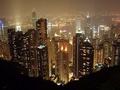
| 07/29/2004 03:28:04 PM |
City Of Lifeby TomH1000Comment: Very striking viewpoint with loads of atmosphere lent by the misty evening. Good one. |
Home -
Challenges -
Community -
League -
Photos -
Cameras -
Lenses -
Learn -
Help -
Terms of Use -
Privacy -
Top ^
DPChallenge, and website content and design, Copyright © 2001-2026 Challenging Technologies, LLC.
All digital photo copyrights belong to the photographers and may not be used without permission.
Current Server Time: 06/24/2026 02:11:22 PM EDT.