| Image |
Comment |
| 03/03/2005 07:35:18 AM |
MINI. LET'S MOTOR.by JEFFJSBComment: Nice car - if you're around 3cm tall! Defintely billboard comp and well shot. It's just a little unimaginative and is exactly the kind of submission I expected to see. |
| 03/02/2005 07:19:47 PM |
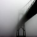
Steel Ghostby MickComment: Bad luck missing out on a ribbon here - but this is a shot to be proud of for sure. |
 Photographer found comment helpful. Photographer found comment helpful. |
| 03/02/2005 05:16:30 PM |
Start your day with Nutellaby srdanzComment: I'm with you on the Nutella sentiment(love the stuff!), but the shot is a let-down in terms of technical content. Composition could be improved by by cropping his ear out and leaving more negative space to the right, but perhaps with a 'pack shot' visdible in the distance on a table or something.
Subject really needs to look happy too or it wouldn't sell many jars. Colour is a bit insipid and, with food particulalrly, you need to make it look rich, appetising and tasty looking. |
| Photographer found comment helpful. |
| 03/02/2005 04:57:50 PM |
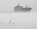
Waiting Out The Fog by lennywellsComment: Remarkable finish on this photo - I'd love to see what you started with. I imagine it was very atmospheric anyway, but if it wasn't heavily edited then this is amazing scene. Very nice shot. |
| 03/02/2005 04:55:54 PM |
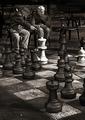
Kibbitzers for Eternityby jjbeguinComment: Nice bit of journalism here. It's spoilt a bit though by the editing (perhaps combined with shadow/hilight filter) and the skewed angle anticlockwise.
Good viewpoint and composition, and especially nice capture of subjects' discussion. |
| Photographer found comment helpful. |
| 03/02/2005 12:38:57 PM |
The Marshby RefocusedComment: I was kidding about the challenge brief (free study?!).
: )
I love this pic. |
| 03/01/2005 06:51:00 PM |
World War II Ruinsby clearlakemikeComment: Nice observation with great light. I'd like to see the viewpoint even closer to the ruin so that we can see rust, etc. The background landscape really isn't as interesting as the foreground. |
| Photographer found comment helpful. |
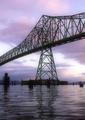
| 03/01/2005 06:47:21 PM |
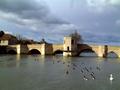
Historic Monk Toll Bridgeby SnapperLComment: :: Hello from the Critique Club ::
............................................................
A lovely bridge and nice clear, open scene.
You had some good light too, but the sky is quite dull. Therefore I would have featured more lower foreground and less sky. The composition would have been stronger due to the wildlife and water texture. Depending on how much water there was in front of you you could have simply pointed lower down, but if there wasn;t much more then you could have got closer to the bridge and shot it a dynamic angle gaining more details in the process.
Getting lower to the water would definitely have added some points as the effect of this is very dynamic and brings the viewer away from eye-level (which is where everyone expects to view a shot).
You could also consider getting an ND filter and stopping down to f16 or so, then setting a longer shutter speed. This would enable the water to rush by seemingly like glass. It would obviously not be suitable for the geese and ducks though.
Keep it up.
Cheers
Jon |
| Photographer found comment helpful. |
| 03/01/2005 06:39:37 PM |
February Thawby rileyComment: :: Hello from the Critique Club ::
............................................................
Nice work capturing the subject in unusual conditions. The icicles add much interest here.
Composition is OK, but the horizontal is at odds with the arrangement, so I'd have taken the shot either more square or much more obliquely. I'm sure that you may have found a view that showed less background, but closer icicles and water detail. Perhaps standiung under the bridge to the left may have yielded this, with enough the bridge to show it's a bridge and plenty of other details to look at.
I agree that the desaturation serves little purpose here since it is mainly used to draw attention the itme selected, and I can find now reason for doing this to the rail.
Cheers
Jon |
| Photographer found comment helpful. |
| 03/01/2005 06:34:06 PM |
Dawnby ZoomdakComment: :: Hello from the Critique Club ::
............................................................
Love the angle here and the water looks just soft enough to be sexy.
Your bridge is interesting and the wooden supports add an unusual element of intrigue. Lighting is cool and mellow, but lacks enough punch to give the shot that wow-factor. Composition is competent and shows enough of the bridge to inform the viewer of its style & materials, although that main support would look more potent off-centre to the right creating a more dynamic line through the shot.
Well done.
Cheers
Jon |
| Photographer found comment helpful. |
Home -
Challenges -
Community -
League -
Photos -
Cameras -
Lenses -
Learn -
Help -
Terms of Use -
Privacy -
Top ^
DPChallenge, and website content and design, Copyright © 2001-2026 Challenging Technologies, LLC.
All digital photo copyrights belong to the photographers and may not be used without permission.
Current Server Time: 06/21/2026 05:25:55 AM EDT.