| Author | Thread |
Comments Made During the Challenge  |
|
|
03/04/2005 10:20:54 PM |
|
Beautiful car and excellent billboard. |
|
 Photographer found comment helpful. Photographer found comment helpful. |
|
|
03/04/2005 08:41:19 PM |
|
Good, simple, to the point. |
|
| Photographer found comment helpful. |
|
|
03/04/2005 08:32:38 PM |
|
i totally see this on a billboard |
|
| Photographer found comment helpful. |
|
|
03/04/2005 07:33:08 PM |
|
Good concept and composition. Very appropriate for a billboard. Could use a little more punch in the color. |
|
| Photographer found comment helpful. |
|
|
03/03/2005 03:28:39 PM |
|
|
|
03/03/2005 07:35:18 AM |
|
Nice car - if you're around 3cm tall! Defintely billboard comp and well shot. It's just a little unimaginative and is exactly the kind of submission I expected to see. |
|
|
|
03/01/2005 04:35:43 PM |
|
Increasing the saturation would help this image a lot. |
|
|
|
03/01/2005 09:37:06 AM |
|
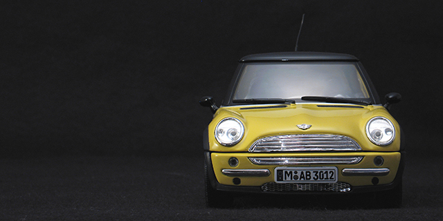
At first glance I thought you must have a helluva big studio, then it hit me. Is that a R/C car (noticed the antenna/wire on the top)? Excellent and simple composition for a billboard. Good job! |
|
| Photographer found comment helpful. |
|
|
03/01/2005 06:42:43 AM |
|
|
|
02/28/2005 09:12:29 PM |
|
I could see this on a billboard. One of my top three. 10 |
|
| Photographer found comment helpful. |
|
|
02/28/2005 07:41:12 PM |
ok, i am voting this challenge in 2 passes. in this pass, you will get a partial comment and a score. then i will come back to comment again. if you have any problem whatsoever with this comment, pm me and let me know. otherwise, take it with a grain of salt...i'm not trying to be a know-it-all, i'm just explaining where i'm coming from in voting this challenge. and, if this comment is NOT helpful (of if you think i'm full of $#!+), don't mark it helpful.
billboards are a science unto themselves. a lot of research has gone into determining just how much information a person can digest and retain in specific time spans. they use this information to develop formulas for determining the number of words and letters to use on billboards, as well as their sizes. they also determine the size and number of visual elements to include.
the graphics/photograph on a billboard are designed to get the point across in a moment. on the road, a driver will have less time with a billboard than a voter will give your image. this is a key element in the challenge: composing a shot that will get its point across quickly and succintly. along those lines, a strong composition will probably have few details and make strong use of negative space.
-------------
great idea for a billboard! it could stand to have a bit more definition so that the blacks of the car aren't completely lost in the background, and maybe it could stand to have the saturization pumped up a notch, but all the same, nice image. one other note, as far as billboards go, another 'rule' is that they are typically laid out left to right, with the graphics/photographs on the left and the verbiage on the right. however, as far as the challenge goes, this works well.
-------------
congrats on your PB, and your top-25 finish. good work!
Message edited by author 2005-03-11 16:14:36. |
|
| Photographer found comment helpful. |
|
|
02/28/2005 09:59:20 AM |
|
Is that a toy car? good shot. |
|
| Photographer found comment helpful. |
|
|
02/28/2005 01:09:02 AM |
|
great image well positioned in the frame |
|
| Photographer found comment helpful. |
Home -
Challenges -
Community -
League -
Photos -
Cameras -
Lenses -
Learn -
Help -
Terms of Use -
Privacy -
Top ^
DPChallenge, and website content and design, Copyright © 2001-2026 Challenging Technologies, LLC.
All digital photo copyrights belong to the photographers and may not be used without permission.
Current Server Time: 06/30/2026 05:07:47 PM EDT.