| Image |
Comment |
| 03/05/2005 12:22:55 AM |
|
| 03/04/2005 07:27:58 PM |
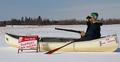
Stressed? Need to be heard? We'll listen. CRISIS HELP CENTERSby IvoComment: Very neat i-deer - erm, sorry 'bout that.
This is actually a very impactful, eye-catching concept. Obviously with some type to offset the benign image, this would be extremely potent and I actually feel that this is the most interesting shot in the challenge. Your title could be: "If you're stressed, we're all ears."
Compsotion note: the 50/50 split is a bit unaesthetic and may benefit from a 60/40 balance (more sky).
Good luck. |
 Photographer found comment helpful. Photographer found comment helpful. |
| 03/04/2005 07:24:29 PM |
United Colors of Benettonby librodoComment: Great comp, nice expression and fits the Benetton 'look' well. If anything, the image is a tad over-smoothed and lacks that key element that catches the attention. Normally a Benetton ad would have a twist in there somewhere, so I feel that, despite technical excellence in the photo, the theme is quite weak. Perhaps if she were dressed like a suicide bomber (whatever they look like) but still with that pretty face, etc. this would cause the right level of interest. |
| Photographer found comment helpful. |
| 03/04/2005 07:16:47 PM |
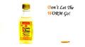
Monte Alban Tequilaby cheekymunkyComment: I understand why you felt you needed type - most billboards have some text. It should have been in the rules. That said, your font is ghastly! Your pic and message are good (a tad too overexposed though) - as is the composition, but I'll pretend your typography was a bit more finely honed!
: ) |
| Photographer found comment helpful. |
| 03/04/2005 06:19:15 PM |
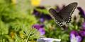
Butterfly Garden, 3 miles aheadby paganiniComment: Yup - if that Butterfly garden has the budget for a billboard then this may well tempt me! Lovely shot and composition. Background is a little too busy. |
| 03/04/2005 06:14:20 PM |
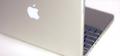
The New Powerbook. Simply Sexy.by GeocideComment: I agree with the sentiment indeed! For Apple though, it's not really they're style, but for [a PC] this would be a clean approach and the product speaks for itself. |
| Photographer found comment helpful. |
| 03/04/2005 06:12:59 PM |
|
| Photographer found comment helpful. |
| 03/04/2005 06:04:49 PM |
|
| Photographer found comment helpful. |
| 03/04/2005 06:04:09 PM |
|
| Photographer found comment helpful. |
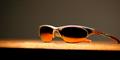
| 03/04/2005 03:54:22 PM |
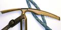
Oakley Never Leave Home WithOut Themby Travis99Comment: A couple of things:
1. Nice reflection on the glasses and richness of tone.
2. The crop is unfortunate. You could have enlarged the shades in the frame and cropped out the intrusive black area at the bottom. This would then leave the glasses as 'hero' and leave just enough space for minimal text and logo. As it stands, the first thing you're aware of is the table edge.
3. shot is a touch noisy. You could try running it through neat Image (or equivalent) or converting to lab color mode in Photoshop and blurring the channels 'a' and 'b' until the noise is reduced. This leaves the definition (Lightness channel) intact.
And lastly, Oakleys are unfortunately terribly made!! If you look at the stems you'll probablly notice some poor spraying. They're WAY over-priced compared to some much better brands (Adidas, RayBan) for equivalent outlay. |
| Photographer found comment helpful. |
Home -
Challenges -
Community -
League -
Photos -
Cameras -
Lenses -
Learn -
Help -
Terms of Use -
Privacy -
Top ^
DPChallenge, and website content and design, Copyright © 2001-2026 Challenging Technologies, LLC.
All digital photo copyrights belong to the photographers and may not be used without permission.
Current Server Time: 06/21/2026 03:58:30 AM EDT.