| Image |
Comment |
| 07/23/2009 04:48:42 PM |
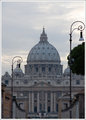
8068-stPeters.jpgby SaraRComment: Gotta love old buildings, I do. They just suck when they stick a traffic light in front of it and obnoxious light posts. Mother nature growing that tree does nothing for the over all pleasing affect either.
clone out the light posts, then you will have room to work with on the left hand side of the building domes so you can clone out the tree and make it look the same as the other side. it is all very boring and grey, you can do so much with this gorgeous building. Bring in some layers , bring out the whites and grey , dodge and burn your heart out, it can take it, you so have to do something with that boring normal European sky, it always looks that, you have some lovely layers in those clouds, bring them out, and even though the grey is boring, i would paint that brown building the same colour grey so you can not drawn to that, then the lamp posts then the tree. |
 Photographer found comment helpful. Photographer found comment helpful. |
| 07/23/2009 04:40:26 PM |
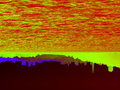
Surreal Skylineby GeneralEComment: i am not sure why you would want to take a perfectly acceptable picture and turn it into what ever this is. what the hell is it. I do like the red though, could be the pits of hell or outer space.
Tell you what though, if you stuck a $9000 ticket on it and said it was modern surrealism you would sell it |
| Photographer found comment helpful. |
| 07/23/2009 04:36:03 PM |
0807by jdannelsComment: your stolen moment if out of focus. adn they are all going to be sweept down that river that if falling off the side of your page. it would have been better if you had got your person thingy in focus and not worry about the rest of it. He looks like a blob with a tail coming out. also that bridge sticking out of his head is not helping anything with this picture. The rail is nice and sharp though. I would go out and re shoot it |
| Photographer found comment helpful. |
| 07/23/2009 04:32:59 PM |
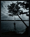
Solitude in the Moonlightby HipychikComment: it feels empty, like there is no one there. this is something I would produce, darks bare lights. if you had moved to the left a bit or even gone into the water, you would have had a little more space between the tree adn sail and the sail would have been turned a tad bit. A chainsaw would have achieved the same affect too if you had taken that lower branch off |
| Photographer found comment helpful. |
| 07/23/2009 11:51:37 AM |
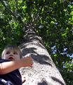
I have to grow How Tall?by robsComment: / //www.dpchallenge.com/forum.php?action=read&FORUM_THREAD_ID=921511&page=1this is the reason for the comment below
this is a sweet shot. I think it would have worked better in many different ways. if you had had him on the ground trying to hug the tree, and looking up it would have had such a bigger impact. then all the blown out spots on the trunk would have worked for you instead of against you.The focus is on his arm adn trunk, his face is too shadowed, it would have been better if he had been looking up , then the shadows would have caught his chin line, and cheek bones and worked with you boy so basically redo th.e whole shot
nice looking kid Message edited by author 2009-07-23 19:50:19. |
| Photographer found comment helpful. |
| 07/23/2009 11:47:15 AM |
Angel without Wingsby geinafetsComment: very nice, the blue in the nail polish takes away, maybe fluffing up that gorgeous naturally curly hair would bounce some more light through it to give it an almost ethereal glow to her head. The darkness int eh bottom right is a little distracting, but i am not sue if having just a pure clean white all over would make her appear flat. a little sharpening would go a long way with this too. putting her leg just a tad bit back a bit more closer to her would give her the length versus her just kinda looking like she has it straight out from her body. sharpen it too Message edited by author 2009-07-23 11:53:10. |
| Photographer found comment helpful. |
| 07/22/2009 10:25:57 AM |
|
| Photographer found comment helpful. |
| 07/22/2009 10:25:47 AM |
|
| 07/22/2009 10:25:34 AM |
|
| Photographer found comment helpful. |
| 07/22/2009 10:25:16 AM |
|
| Photographer found comment helpful. |
Home -
Challenges -
Community -
League -
Photos -
Cameras -
Lenses -
Learn -
Help -
Terms of Use -
Privacy -
Top ^
DPChallenge, and website content and design, Copyright © 2001-2026 Challenging Technologies, LLC.
All digital photo copyrights belong to the photographers and may not be used without permission.
Current Server Time: 05/05/2026 01:17:30 AM EDT.