| Image |
Comment |
| 08/03/2009 10:32:16 AM |
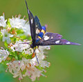
ButterflyGirlby Rino63Comment: Hello from the Critique Club!!
My first reaction to this shot is , Wow how pretty, the colours are lovely along with the flower.
Technically it is over sharpened, you have got the flowers and the head of the butterfly spot on, but the wings are seem to be very oversharpened. There is a distinct halo around one of the legs, the top wing has a distinct blur around it, which I am sure was caused by the butterfly moving.
The blues are over saturated and come across as blown out and appear almost sparkly on the wings. The position of the butterfly is a good one bar the top of the wing cut off. I think that if you are going to go with the butterfly wings cut off, then make a tube with your hand and look through it, it is a close crop of just the head and a little of the body, but would have cut out the blurred wings.
|
 Photographer found comment helpful. Photographer found comment helpful. |
| 08/03/2009 10:11:49 AM |
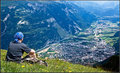
quiet_observationby MistyMuckyComment: Critique Club!
What an amazing view you have and obviously some strong legs to take you there.
I love this shot, you choose so well, the quietness of the mountain overlooking the hectic busy metropolitan of life. I think putting your bag on the other side of you would have looked artistically better.
The placement of you in the shot, is well chosen. The details are really brought out by your sharpening. The grass is a little over sharpened though but does not distract from the shot at all. In post processing , a little dodge and burn on the mountains could have brought them out a bit. They seem a little flat, so making the darks a little darker would have made them pop out. Good job on getting the white balance corrected in pp.
Overall, a very good photo.
|
| Photographer found comment helpful. |
| 08/03/2009 09:55:13 AM |
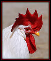
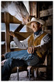
Roosterby KatheComment: Hello from the Critique Club!!
Well, wow what can I say, this has to be the most handsome Rooster I have ever seen.
An amazing job on the exposure, I do not think that the whites are blown out, Roosters tend to have very shiny feathers and you have caught all the details in them. The sharpening is excellent, there is a very small halo of white ringing the red, but it is hardly noticeable.
The top may have been cropped just a little more. The border choice was a good one. You used every single inch of your 720 allowance. DOF is very good.
Overall this is an excellent shot and placed very well. |
| Photographer found comment helpful. |
| 08/03/2009 09:46:54 AM |
Curiousby SiggavComment: Hello from the Critique Club!!
This is so funny, I showed it to my kids and they are giggling now too!!
I think you did really well to get to this shot, I was impressed that the cat was actually looking at it upside down and you had not just flipped it. There is a lack of sharpness on the cats head, maybe a tweak or two with sharpening and saturations in post processing could have made a little bit of a difference.
The black border is very heavy, but it really works for this shot. Bumping up the ISO would have helped as well, bu that can be hard when you are catching a moment like this.
I can not wait to see it when you get fish in and hopefully the cat will be even more interested and we will see some more amazing shots
|
| Photographer found comment helpful. |
| 08/02/2009 12:52:23 PM |
|
| Photographer found comment helpful. |
| 07/29/2009 12:29:54 PM |
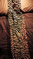
Anyone seen my pants?by snafflesComment: Critique Club
Those have to be the most fun pants I have seen. You nailed the challenge description very well with your position.
I like how you have lined up the pants lines with the bedspread lines on the left hand side. I gave this a 6 when I voted and here is why.
WHen I looked at the shot, I automatically tilted my head to make the bedspread stripes go in a straight line down the center. I also felt that the pillow wrinkles didn't add to the overall picture and could have been left out or pulled tight to get rid of the wrinkles. The lighting is all focused on the top of the photo, I think an overall bright exposure on the whole strip line would have made this snap off the page at you. I believe that some of this could have been achieved in post processing.
|
| Photographer found comment helpful. |
| 07/29/2009 11:52:53 AM |
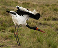
Saddle-billed stork weird positionby gipukanComment: *Critique Club*
What an amazing bird. You certainly captured its position. I think it is important to read the challenge description more carefully to clear up any misunderstandings when shooting for a challenge.
The focus is off in this photograph and needs to be tack sharp on the stork. The colours on this stork are amazing and in post processing these colours could have been boosted to really stand out. Contrast would help this shot, at the moment the bird and the background all seem to be one. It is a fairly flat photograph so a different DOF would help as well. Your ISO is very high and that could account for the grain that I am seeing. Cropping on the left hand side would have got rid of some of the dead space and given more focus on the bird.
With amazing wildlife like this around you , I am sure we will see some stunning work from you.
|
| 07/27/2009 01:05:31 PM |
|
| Photographer found comment helpful. |
| 07/26/2009 11:29:16 PM |
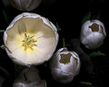
white-and-yellow.jpgby Joker1114Comment: you ahve an amazing inner glow with the left hand flower, i would say do it with the others as well to ahve the impact of OH WOW. right now they are just sitting blobs, make it work, bring out some of those dark greens and give it some dept of field, lovely contrasts and highlights could make this an amazing shot Message edited by author 2009-07-26 23:29:59. |
| Photographer found comment helpful. |
| 07/26/2009 11:27:58 PM |
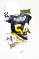
Fifty Fourby KronusComment: nothing for me is saying anything, it looks like a card you could buy at a store. |
| Photographer found comment helpful. |
Home -
Challenges -
Community -
League -
Photos -
Cameras -
Lenses -
Learn -
Help -
Terms of Use -
Privacy -
Top ^
DPChallenge, and website content and design, Copyright © 2001-2026 Challenging Technologies, LLC.
All digital photo copyrights belong to the photographers and may not be used without permission.
Current Server Time: 05/04/2026 09:15:40 PM EDT.