|
|
|
Showing 1291 - 1300 of ~4455 |
| Image |
Comment |
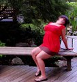
| 09/07/2009 09:57:26 AM | Spunky in the Gardensby Viper_VTComment: Hi from the Critique Club,
You asked for your shot to have a comment from a member of the Critique Club.
Your shot is interesting. Not really sure what you where going for within the rule of thirds or with the blurry face motion.
you have a lovely background which is in focus, sharp and full of interesting details. As for the girl, not the most flattering pose.
There is nothing in ps that I can see that would improve your photo. |
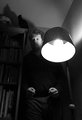
| 09/06/2009 11:34:05 AM | Betrayed by the Clapperby posthumousComment: Hi from the Critique Club,
You asked for your shot to have an in depth comment from a member of the Critique Club.
Interesting shot, I am not too sure what you are going for here , I am getting mixed messages with the things in your shot.
There is almost an Edgar Allen Poe thing going on with your bird and books and light. Those are excellent, you have done very well to get such clean focus. I like the brightness of the light, it is over powering and in your face and I am getting a slight headache from looking at it all the time. I am not sure what message you are trying to convey with your model. There is just a blank look on his face but he has clenched fists. Is he supposed to be intimidating? If he is , he needs a facial expression and some depth into his eyes as they are just black black holes right now. Maybe a scowl would have helped mesh this whole shot.
This is definitely one of the more dramatic shots in this competition and the more you look the more you think and see.
Excellent , well done, I am off for some asprin Message edited by author 2009-09-07 10:46:23. |  Photographer found comment helpful. Photographer found comment helpful. |
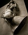
| 09/06/2009 11:27:11 AM | Phsycopathby GudjonottoComment: Hi from the Critique Club,
You asked for your shot to have an in depth comment from a member of the Critique Club.
You have got drama going on in here. You didn't do to badly with your score here, most people don't think statues are very hard to work with versus a live scene. But you picked a very dramatic statue.
The focal point is on the base of the statue when it needed to be higher up on the face. A different angle, maybe getting yourself a little higher we could have seen more details of what is pulling the mans eyelids. The black triangles are distracting in this shot and pull away from the main focal point.
Your post processing is solid though.
|
| 09/06/2009 11:22:51 AM | Happy/ Sadby martinsphotoboxComment: Hi from the Critique Club,
You asked for your shot to have an in depth comment from a member of the Critique Club.
Well you certainly go the drama bit. Remember to read the description and look at the treads in the community to get an idea as to what the challenge is. For this particular challenge it was more about the lighting to make a dramatic shot, versus a drama shot.
I am curious as to why you had this shot up to 2 minutes of exposure time. You lighting is fairly flat on the red and disappears in the black somewhat. The choice of materials could be different as the red one is really showing up the lines in the fabric and is a little distracting.
Your sharpness is very good on this and I like the lighting on the rings.
| | Photographer found comment helpful. |
| 09/06/2009 11:11:05 AM | You looking at me?by Delta_6Comment: Hi from the Critique Club,
You asked for your shot to have an in depth comment from a member of the Critique Club.
Excellent shot!!!!!!!!!!!
There is not a lot to say about this shot as it is really good. A little more focus on the eyes ,,maybe, a tiny bit more saturation to bring out those oranges. Bar that excellent!!!!!!!!!!!!!!!!!
I would love to see what you could do with this shot in advanced editing!
Well done on a great shot and an excellent placement | | Photographer found comment helpful. |
| 09/06/2009 11:07:51 AM | Three for the thirdsby radutheodorComment: Hi from the Critique Club,
You asked for your shot to have an in depth comment from a member of the Critique Club.
Very nice shot!!!!
There is not a lot here that can be improved on, it really is a lovely shot. Reading your notes I see that you ran out of time. That is a shame as I would love to see what you could have done with this shot with more time. Allow more time!!!!!!!!
I would also love to see this show without the girls in it, that would have been a dramatic shot as well. Even though you didn't do any post processing, it does look good.
It just goes to show you that you don't need to post process to have an amazing shot. well done |
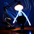
| 09/06/2009 11:01:20 AM | Parasite Light Fightby BeefnCheezComment: Hi from the Critique Club,
You asked for your shot to have an in depth comment from a member of the Critique Club.
Definitely a fun shot here, you scored fairly well for a last minute entry!
I think that if you had put a little time into this this would have been on the front page. here are the reasons why. Your top lamp is very bright, either use a very low wattage bulb or have it turned off completely. You can achieve a light painting by sticking the light source straight into the lamp and leaving it there for several seconds. This would have illuminated the bulb and given you the outline of it as well. It would also not blow it out and make it such a focal point in your shot.
using your plain white light source, you could illuminate the desk top and all the outlines of the lamps. As you can see in this shot on your lamp posts they are all jagged where they have caught the light. This almost looks like over sharpening and JPEG compression, where in fact it is just the light being caught in the grooves. Using yoru white light source, illuminating that cord and the plug would have made it stand out more and the plug would not be so bright as to blend away in the shot. Moving the plug also to your left would have given it distinction.
So after doing all this with you white source, then go crazy with your blue!!!!
I do not think that there is a lot in post processing that you could have done with this shot, it is pretty good.
Like I said, very good entry for last minute!
| | Photographer found comment helpful. |
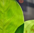
| 09/06/2009 10:35:00 AM | leafby katestangeComment: Hi from the Critique Club,
You asked for your shot to have an in depth comment from a member of the Critique Club.
Lovely use of natural light and leaves here
To me your sun bubble is very distracting, cropping that out may have helped with several points in the scoring. I notice that one of your comments said something about the dark green, I actually like it, I think it gives definition to the shot.
The background is a little distracting though,especially the white line running down the shot,
You have done a gorgeous macro of this, you are tack sharp and I can see lots of details in the leaves. I can see nothing that you could do to improve this shot in post processing with colours, sharpness etc
Well done
|
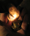
| 09/06/2009 10:17:36 AM | Jackpot!by GeneralEComment: Hi from the Critique Club,
You asked for your shot to have an in depth comment from a member of the Critique Club.
I can see what you where going for here. You read the description of the challenge and you used the light to create a scene.
I think what is needed here is possible a focus, some sharpening, some focus, a tripod, more lighting, a faster shutter speed.
It is a good idea that you had though, maybe glueing the coins to some string and making them appear to fall into your hand out of a cup might help with the focus issue.
Some light underneath the hand may have helped a little also with the focus. Laying your hand on a table would have steadied your hand and not given you hand shake. The top of your hand is slightly cut off as well with the cup(?) move back just a tad to incorporate the cup and fingers.
| | Photographer found comment helpful. |
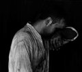
| 09/06/2009 10:05:17 AM | left to the imaginationby ineedauniquenameComment: Hi from the Critique Club,
You asked for your shot to have an in depth comment from a member of the Critique Club.
Excellent shot, you read the challenge description and used light to make a very dramatic shot. I gave this an 8 whilst it was voting.
There is not a lot to critique here to be honest, a little more sharpness would be my only suggestion.
It really is an excellent emotive shot. Well done indeed
| | Photographer found comment helpful. |
|
Showing 1291 - 1300 of ~4455 |
Home -
Challenges -
Community -
League -
Photos -
Cameras -
Lenses -
Learn -
Help -
Terms of Use -
Privacy -
Top ^
DPChallenge, and website content and design, Copyright © 2001-2026 Challenging Technologies, LLC.
All digital photo copyrights belong to the photographers and may not be used without permission.
Current Server Time: 05/04/2026 01:55:10 AM EDT.
|