| Image |
Comment |
| 09/25/2009 11:48:28 AM |
t r e p i d a t i o nby CuttoothComment: Hi from the Critique Club
You asked for a comment from a Critique Club member.
Amazing clouds!!!
The clouds are the selling point in this shot, they are very well processed, clean adn very moody, which I love. Your sunset behind it is good, you could have brought out a few more colours in it though. In post processing, grab your lasso tool, feather it to 150ish, and select the sunset. Then use your selective colour to add more feeling to it. This way, you will be able to only affect the sunset and nothing else in this shot. I would do the same for the foreground but use the brightness and contrast.
I think cropping some of your bottom off would have helped this with a focal point. At the moment there is none and the eye is searching for one.
This is a good shot that placed well in this challenge
|
 Photographer found comment helpful. Photographer found comment helpful. |
| 09/25/2009 11:38:30 AM |
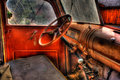
Old Rust Bucketby jawsh3539Comment: Hi from the Critique Club
You asked for a comment from a Critique Club member.
Nice placement for this shot and good all around comments during your voting period, even your wife thinks so!!!
I think what this shot is lacking is details. It is very smooth, with HDR the finer details of a shot are meant to shine on through. Here it is very smooth and no textures to be seen. Back off a little on the noise adjustment or the Topaz. Your colours are very rich , almost too rich. Using a layer of black and white would have helped with this shot and it would have also brought out more of those details that are lacking. Your DOF could do with some more contrast, your POV could have been a little lower, just to get teh steering wheel out of the center there.
Overall, you did a great job, I am looking forward to seeing more of your work! |
| 09/25/2009 11:30:39 AM |
"Johnny Appleseed"by 777STANComment: Hi from the Critique Club
You asked for a comment from a Critique Club member.
Interesting shot, interesting processing. To me, this is very over processed, with HDR you are meant to see teh finer details in things. I am having a hard time with finding the details. The shadows on the face are very harsh and are washed away with no details, the apple, to my eye actaully looks like a peach. The pants though are spot on and very well done in your processing. They almost looked acid washed.
The grain here is not helping so much, I thought you added grain till i read your notes, so maybe a little noise reduction would have smoothed some grain away. But not a lot as it would take away from the grunge of this shot.
|
| 09/25/2009 11:23:07 AM |
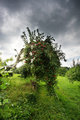
Ye shall not eat of itby posthumousComment: Hi from the Critique Club
You asked for a comment from a Critique Club member.
An interesting shot, I thought this one was for deep DOF until I realized that it was not over yet. I do actually like this shot, in your comment you said it was not HDR, but I think that the details adn depth that you brought out this could well have been a very subtle one. I love the leading line of the tree branch and the punctuations of red from the apples.
This may not be the most interesting subject in the world, but I think it is simple and clean. Your horizon is tilted a far amount. you have amazing clouds going on, maybe if you had darkened them a little more on the edges and the ground it would have set off to be a more moodier shot and really popped that tree. Maybe a crop off the bottom would have benefited this shot as well
|
| Photographer found comment helpful. |
| 09/25/2009 11:12:55 AM |
[ S MO K E D ]by ericwooComment: Hi from the Critique Club
You asked for a comment from a Critique Club member.
You placed nicely with this shot, well done.
I think this would have been a stronger shot if you had managed to light the swirling smoke here. Right now the lighting is fairly flat on your matches and there are not many details shining through for me. You have the golden opportunity here to make this really stand out, you have the flat, straight stitches and then the smooth buttery curves of the smoke. Your end matches are lost in the blackness of the background. A little shadow highlight may have brought out a little more interesting detail in the actual wood too.
Overall a nice job
|
| 09/25/2009 09:35:39 AM |
A day at the beach by LalliSigComment: I will be honest here, she kinda looks dead. IF the eyes where looking at the camera that may have helped, the post processing is dark which adds to the shot. your horizon is tilted as well and you have strange lines all over the sky areas. A little colour would have made this seem a little less morbid. Excellent focus on the body though |
| Photographer found comment helpful. |
| 09/25/2009 09:31:49 AM |
|
| Photographer found comment helpful. |
| 09/23/2009 09:59:41 AM |
Seascape with boatsby Rino63Comment: Hi from the Critique Club
You asked for your shot to have a comment by one of the members of the Critique club
Lovely shot, i really like it.
The comments that you have received pretty much tell you all you need to know with this shot. A fast shutter speed would maybe illuminate the blurry boats. A little more saturation or selective colour would have given your colours some more depth. You have some in camera splotches in the top left corner that you could clone in in Advanced editing.
Overall a pretty shot, well done |
| Photographer found comment helpful. |
| 09/23/2009 09:53:30 AM |
wall ride!by chrispComment: Hi from the Critique Club
You asked for your shot to have a comment by one of the members of the Critique club
this is a very clean cut shot. your sharpness is spot on, clarity is good, DOF and POV are very good. IT just does not look HDR and that is really the only problem you have going on here.
The other shot that you put up, is 100% better than this shot in every way. You have the action, the dodge and burn is excellent and the POV is outstanding. But most importantly it does look HDR.
|
| Photographer found comment helpful. |
| 09/23/2009 09:27:10 AM |
High Tideby taljComment: whoooooooooooohoooooooooooooooooo you got a ribbon!!!!!!!!! Well done!!!!!!!!!!!! |
| Photographer found comment helpful. |
Home -
Challenges -
Community -
League -
Photos -
Cameras -
Lenses -
Learn -
Help -
Terms of Use -
Privacy -
Top ^
DPChallenge, and website content and design, Copyright © 2001-2026 Challenging Technologies, LLC.
All digital photo copyrights belong to the photographers and may not be used without permission.
Current Server Time: 05/02/2026 02:21:19 PM EDT.


![[ S MO K E D ]](https://images.dpchallenge.com/images_challenge/1000-1999/1093/120/Copyrighted_Image_Reuse_Prohibited_821391.jpg)