| Image |
Comment |
| 11/01/2014 09:57:18 PM |
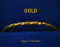
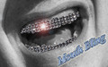
Gold: Elegance in Minimalismby GeneralEComment: I would have not had the upper word at all. So... the first thing my eyes got to would be your great POP! of that gold jewelry making me want to buy it.
Also, I'd have cloned out the imperfections in the blue at the bottom that are distracting. 6 |
 Photographer found comment helpful. Photographer found comment helpful. |
| 11/01/2014 09:57:10 PM |
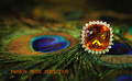
Vain Peacock Companyby enikoComment: Wow, you did a great job on the making me like the jewelry you're selling.
Unfortunately, the "eye" of the peacock feather competes for my attention against the jewelry. Cover the left peacock "eye" with your hand... and then view your ad. It really makes the jewel pop out and grab the viewer's attention.
I love the DOF. 7 |
| Photographer found comment helpful. |
| 11/01/2014 09:57:03 PM |
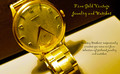
1960 18 Karat Gold Longinesby robstComment: I don't like your font... it needs to be able to be quickly read as I pass by your billboard or flip through my magazine to get to another article. It needs to grab me, not make me struggle to read it.
Also, the bright yellows in the watch band and the blown spots compete for my attention (and win) against the face of the watch.
I do like your composition, although I would not have cropped it so close on the upper edge of the face of the watch.
I wish the face of the watch were the brightest spot in the whole image... so my attention would go there immediately and want to stay there... and buy your jewelry. :D
I love the angle of the watch at a tilt to make the advertisement not so rigid. Good choice. 6 |
| 11/01/2014 09:56:32 PM |
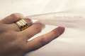
Simpleby RKTComment: I totally love the focus being so much on the jewelry (something so many did not do in this challenge) and that you've kept things simple...
I also like the composition. But... on my monitor, there are splotchy areas in the upper third and in the other white areas.
I think a professional advertisement would have smoothed the skin a bit... especially the pointer finger knuckle which competes with the ring a bit in the focal range.
Where the middle finger meets the fabric is an odd blob on my monitor.
I know it sounds like I hate this image... LOL! But, actually, it's one of my favorites so far.
7 |
| Photographer found comment helpful. |
| 11/01/2014 09:56:21 PM |
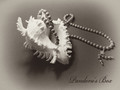
Pandora's Boxby jin_tonicComment: I like it... but I think the main part of the jewelry that you're trying to sell to me should be in focus... especially since the shell is in focus.
7 |
| Photographer found comment helpful. |
| 11/01/2014 09:55:32 PM |
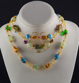
Twisted Fantasyby ecroceComment: Lovely composition and colors! The lighting does not highlight the jewelry enough, in my opinion, to be a professional advertisement for jewelry. I'd like to see the jewelry steal the show in the image by making me not be able to look anywhere else in the image for long.
As it is, the brightest spots of the image are the white display. Make that jewelry POP out at me so much that I can't ignore it!
7 |
| Photographer found comment helpful. |
| 11/01/2014 09:55:24 PM |
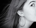
Playful Graceby markwileyComment: I love this idea! And I love the hair blowing!
I'd have cropped the top to the middle of the eyebrow... or even crop it to the middle of her eye...and made the earring be the brightest spot in the image to draw attention to the jewelry you're trying to sell.
The little bit of shadows where I assume her mouth is starting are a bit distracting, but if you crop in the horizontal middle of her eye, you could take off some of the right of the image too and that would get rid of those mouth shadows. I'd also have cloned out the little bit of slit in her ear hole that makes me think the earring is going to be too heavy and cause slits in my ears.
I sound like I really don't like it, but that's not true. I DO love your idea here and it could be tweaked to be the winner of the challenge.
8 |
| Photographer found comment helpful. |
| 11/01/2014 09:55:02 PM |
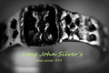
silverby mrbig65Comment: I'd really like to see what you're advertising to get me to want to buy, but the shadows are so deep... I can't see the main details.
5 |
| Photographer found comment helpful. |
| 11/01/2014 09:54:54 PM |
|
| Photographer found comment helpful. |
| 11/01/2014 09:54:48 PM |
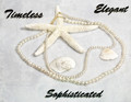
Classic Pearlsby illini75Comment: The pearls have to be tack sharp in an advertisement, I think.
I love the composition and your arrangement of the scene.
I really dislike your font and the harsh drop shadow.
7 |
Home -
Challenges -
Community -
League -
Photos -
Cameras -
Lenses -
Learn -
Help -
Terms of Use -
Privacy -
Top ^
DPChallenge, and website content and design, Copyright © 2001-2026 Challenging Technologies, LLC.
All digital photo copyrights belong to the photographers and may not be used without permission.
Current Server Time: 08/16/2026 05:40:30 PM EDT.