| Image |
Comment |
| 02/21/2008 10:08:49 AM |
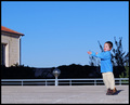
Hoping for a Peaceful Future...by michelle232Comment: This doesn't say "Peace" to me... It says "Play". I think I would prefer the building to be cropped out... as it is, it competes with the smaller and more important subject. |
| 02/21/2008 10:07:31 AM |
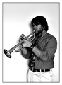
Peaceby Moose408Comment: Cute girl... could use more light on the subject and more focus, IMO. |
 Photographer found comment helpful. Photographer found comment helpful. |
| 02/21/2008 10:07:12 AM |
|
| 02/21/2008 10:05:52 AM |
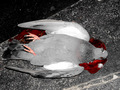
peacefulby whiterookComment: Too grainy, in my opion. The colors and composition are lovely. |
| 02/21/2008 10:05:23 AM |
|
| Photographer found comment helpful. |
| 02/21/2008 10:04:42 AM |
|
| Photographer found comment helpful. |
| 02/21/2008 10:04:00 AM |
|
| 02/21/2008 10:03:51 AM |
|
| Photographer found comment helpful. |
| 02/21/2008 10:03:03 AM |
Enlightenmentby iBobberComment: I can't see the features very well on your idol.
The colors are really good! |
| Photographer found comment helpful. |
| 02/21/2008 10:02:34 AM |
|
Home -
Challenges -
Community -
League -
Photos -
Cameras -
Lenses -
Learn -
Help -
Terms of Use -
Privacy -
Top ^
DPChallenge, and website content and design, Copyright © 2001-2026 Challenging Technologies, LLC.
All digital photo copyrights belong to the photographers and may not be used without permission.
Current Server Time: 06/19/2026 09:22:24 PM EDT.