| Image |
Comment |
| 02/25/2008 09:23:29 AM |
|
 Photographer found comment helpful. Photographer found comment helpful. |
| 02/25/2008 09:23:01 AM |
r é g l i s s eby AlainComment: Looks like he/she's squinting from the flash...The eyes should be the focus, I think. |
| Photographer found comment helpful. |
| 02/25/2008 09:22:32 AM |
|
| Photographer found comment helpful. |
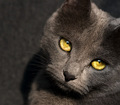
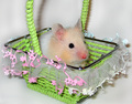
| 02/25/2008 09:19:53 AM |
Blueby shoggyComment: Cutting off the ears brings the focus to the eyes, but they have shadows in them that makes me disappointed. Beautiful cat. |
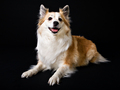
| 02/25/2008 09:19:47 AM |
Tyraby unnevaComment: I wish he/she were looking into the camera... or at least a bit lower so the angle is better. |
| Photographer found comment helpful. |
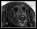
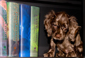
| 02/25/2008 08:32:30 AM |
bookendby TonyTComment: Would be much better without the books, IMO. They compete with that gorgeous fur. |
| Photographer found comment helpful. |
| 02/25/2008 08:31:38 AM |
|
| Photographer found comment helpful. |
| 02/25/2008 08:30:38 AM |
|
| Photographer found comment helpful. |
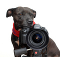
| 02/25/2008 08:30:13 AM |
Houndsby txajaxComment: Too much flash and poor composition, IMO. Also... the eye is red. |
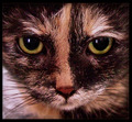
| 02/25/2008 08:29:11 AM |
My Old Ladyby rmtm333Comment: Weird eye color. Good focus and DOF. I'd like the crop to not end in the center of the (photo) left ear, though. |
| Photographer found comment helpful. |
Home -
Challenges -
Community -
League -
Photos -
Cameras -
Lenses -
Learn -
Help -
Terms of Use -
Privacy -
Top ^
DPChallenge, and website content and design, Copyright © 2001-2026 Challenging Technologies, LLC.
All digital photo copyrights belong to the photographers and may not be used without permission.
Current Server Time: 06/20/2026 03:17:29 AM EDT.