| Image |
Comment |
| 06/27/2009 12:44:13 PM |
what do YOU see ?by beekeeperComment: I don't see enough to hold my interest. There needs to be a clear subject, I think. Something to isolate the subject and let the viewer focus on it... like this, maybe:  (not voting) |
 Photographer found comment helpful. Photographer found comment helpful. |
| 06/27/2009 12:41:51 PM |
King of POPby rkaushikComment: Timely entry. The whites being blown and the image quality of the original detract from this image to me, I fear. (not voting) |
| Photographer found comment helpful. |
| 06/27/2009 12:40:48 PM |
Welcome to your Worst Nightmareby loveComment: Creepy. :)
I really like how you've set the subject so far left and all of the others in the background are just perfect DOF to give us the idea, yet still highlight the one subject. (not voting) |
| Photographer found comment helpful. |
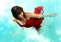
| 06/27/2009 12:39:55 PM |
Lady in the Waterby JaimeVinasComment: 

While not exactly "Never Seen on DPC!", it certainly is well done. I really like it. The slight motion o fthe water and even the blown highlights upper left. The colors work well together and the focus is spot on! (not voting) |
| Photographer found comment helpful. |
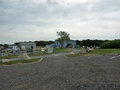
| 06/27/2009 12:34:46 PM |
Day at the Dumpby whiterookComment: Well, I don't recall a photo of a dump here. :) There are two large sensor dust spots that could have been cloned out of the sky to be less distracting.
I wish the subject were filling the frame a bit more to grab the viewer's attention and hold it longer.
Also, it seems a bit 'dingy'... could use some brightening, I think. (not voting) |
| Photographer found comment helpful. |
| 06/27/2009 12:32:14 PM |
|
| Photographer found comment helpful. |
| 06/27/2009 12:31:00 PM |
Contagiousby L1Comment: LOL... I like the title trying to confuse the viewer.
I wish the focus weren't off on the left side... just a tad bit more DOF would have been better, I think. That would also take care of the noise on the left and lower left corner. (not voting) |
| Photographer found comment helpful. |
| 06/27/2009 12:29:51 PM |
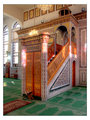
A mosque's arabesque pulpitby HighNoonerComment: It's unusual, for sure.
It's also an interesting piece of architecture. I think, though, for the image to be really interesting, the subject should be offset to one side or the other, not centered, to really grab the viewer. Also, adding in a human would give it scale and even more interest, I think. (not voting) |
| Photographer found comment helpful. |
| 06/27/2009 12:28:18 PM |
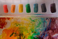
A Colorful Subjectby Blue MoonComment: Could use some brightness/contrast to help this otherwise interesting and fun image, I think. The whites need to be white and fully contrasting with the colors. (not voting) |
| Photographer found comment helpful. |
| 06/27/2009 12:27:25 PM |
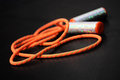
Skipping ropesby zaroziniaComment: It's not exactly a new subject  , but it's rare here, for sure. I wish the handles were more in focus... more DOF would help this really pop from the wonderful black background instead of receding into it, I think. (not voting) |
Home -
Challenges -
Community -
League -
Photos -
Cameras -
Lenses -
Learn -
Help -
Terms of Use -
Privacy -
Top ^
DPChallenge, and website content and design, Copyright © 2001-2026 Challenging Technologies, LLC.
All digital photo copyrights belong to the photographers and may not be used without permission.
Current Server Time: 06/19/2026 03:25:07 PM EDT.