| Image |
Comment |
| 07/08/2009 07:31:01 PM |
Ground Masalaby jfritz27Comment: an 8 from me... I like the angles and shapes and textures. Good work. (voted earlier, back to comment) |
| 07/08/2009 07:30:42 PM |
Sea of Love by halopesComment: Oh... totally cool. SUCH great compostion. 9 (voted earlier, back to comment) |
 Photographer found comment helpful. Photographer found comment helpful. |
| 07/08/2009 07:30:21 PM |
Cut to fitby korpenComment: I hope the frame is legal because I really like this. 9 (voted earlier, back to comment) |
| Photographer found comment helpful. |
| 07/08/2009 07:29:59 PM |
|
| Photographer found comment helpful. |
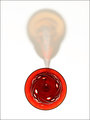
| 07/08/2009 07:29:34 PM |
Red Glassby jaysenComment: fabulously "from above". I really like this. 9 (voted earlier, back to comment) |
| 07/08/2009 07:29:14 PM |
Gothamby Five_SeatComment: A bit of noise in the sky makes this a 9. The composition and colors are really wonderful. (voted earlier, back to comment) |
| Photographer found comment helpful. |
| 07/08/2009 01:20:30 AM |
|
| 07/08/2009 01:20:07 AM |
Going downby gminkComment: "Photograph any subject from a vantage point above it."
I feel like I am at the same level as the subject... *sigh* DNMC, in my opinion... I'm sorry. |
| 07/08/2009 01:20:05 AM |
Incoming Tideby TomCubisComment: "Photograph any subject from a vantage point above it."
I feel like I am at the same level as the subject... *sigh* DNMC, in my opinion... I'm sorry. |
| Photographer found comment helpful. |
| 07/08/2009 01:20:01 AM |
Cruzin Havasu...by L800LisaComment: "Photograph any subject from a vantage point above it."
I feel like I am at the same level as the subject... *sigh* DNMC, in my opinion... I'm sorry. |
Home -
Challenges -
Community -
League -
Photos -
Cameras -
Lenses -
Learn -
Help -
Terms of Use -
Privacy -
Top ^
DPChallenge, and website content and design, Copyright © 2001-2026 Challenging Technologies, LLC.
All digital photo copyrights belong to the photographers and may not be used without permission.
Current Server Time: 06/20/2026 05:59:48 PM EDT.