| Image |
Comment |
| 08/19/2003 12:35:32 PM |
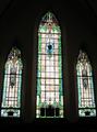
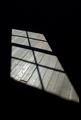
Church Windowsby mcrochipComment: I tend to see church windows as existing artwork, and I can't see what you've added to it. I also don't think the negative space here adds any kind of 'wow'. 2 |
| 08/19/2003 12:34:29 PM |
|
| 08/19/2003 12:33:53 PM |
Hairby AnastasiaComment: I like the use of soft-focus here, but it does result in just a little too much loss of detail in her hair. I wish you could have got the background to appear darker, there's also too much noise in the top-left. Nice lighting. 7 |
| 08/19/2003 12:31:20 PM |
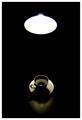
Coffee and lightby e301Comment: Simple and effective. Good use of -ve space, your lighting works well here. 8 |
 Photographer found comment helpful. Photographer found comment helpful. |
| 08/19/2003 12:11:46 PM |
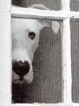
Peek by AleciaComment: Absolutely superb shot that got a 10 from me, sorry I didn't comment during the challenge. Now you've taken 2 of my top 10 shots on this site! |
| Photographer found comment helpful. |
| 08/19/2003 11:43:31 AM |
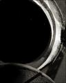
Space?by dacrazyrnComment: I gave this one a lot of contemplation, I don't think this is a shot that can be appreciated in 5 seconds. It definitely leaves me wanting to know what it is, the viewer has to use their imagination to make the best of it. I like to see it as a porthole into space... Superb textures and composition, great use of light and shadow. Very good clarity. 8 |
| Photographer found comment helpful. |
| 08/19/2003 11:40:50 AM |
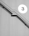
10,000,000 litresby hortopthComment: Great shot, I love the light and shadow here. Shame about the wide-angle distortion, I wish we could correct it in Photoshop. Effective exposure, great composition. 8 |
| Photographer found comment helpful. |
| 08/19/2003 11:38:53 AM |
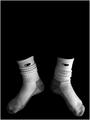
Championsby JPRComment: An amusing shot, effectively captured. Well done for making your nackground so uniformly black. Great lighting. I'd say that the 'wow' factor here is definitely in the -ve space. 8 |
| 08/19/2003 11:25:31 AM |
Shadows and Panesby christyrackComment: I love this shot, the texture of the wood is really enhanced by the use of -ve space here. Effective composition, you've got a great eye! I'm impressed by how much contrast there is here between the light and shadow. 8 |
| Photographer found comment helpful. |
| 08/19/2003 11:23:29 AM |
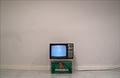
The Essentialsby jgal76Comment: Great concept. Shame about the distortion caused by your wide-angle lens, but as we're not allowed to apply correction in Photoshop, I'll ignore it. A bit less glare on the TV would have helped. The dirty white wall behind the telly is an effective touch. 8 |
| Photographer found comment helpful. |
Home -
Challenges -
Community -
League -
Photos -
Cameras -
Lenses -
Learn -
Help -
Terms of Use -
Privacy -
Top ^
DPChallenge, and website content and design, Copyright © 2001-2026 Challenging Technologies, LLC.
All digital photo copyrights belong to the photographers and may not be used without permission.
Current Server Time: 07/24/2026 04:59:13 AM EDT.