| Image |
Comment |
| 09/29/2003 08:25:45 AM |
Falling From Flightby ShannonComment: That nice, delicate feather and that horrible obtrusive blocky border. Shame. Score: 7
Without border, score maybe: 9
Nice use of negative space. |
 Photographer found comment helpful. Photographer found comment helpful. |
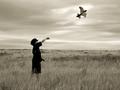
| 09/29/2003 08:24:21 AM |
Future Pilot by SonifoComment: Nice shot, very well exposed. Great sky. One small quibble... I'd have lowered or raised the shot so the horizon did't cut across his torso. I also think a tighter crop would have worked better. 8 |
| Photographer found comment helpful. |
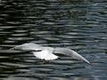
| 09/29/2003 08:22:15 AM |
Flight over waterby PaulMdxComment: Very, very nice. Not sure about the crop though... the ratio of bird to water doesn't balance for me. Either a much tighter crop, or more water to the right could have worked I think. Maybe rotating the shot so the bird is flying more toward the upper right hand corner could have made this more effective. Beautiful textures captured in the water. 6 |
| Photographer found comment helpful. |
| 09/29/2003 08:19:37 AM |
Morning Flightby MikeOComment: This doesn't work for me centred in the frame. Maybe rule of thirds could have helped? A little underexposed for my taste. 5 |
| Photographer found comment helpful. |
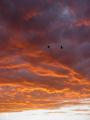
| 09/29/2003 08:18:08 AM |
Silhouetteby Everyday ReneeComment: Beautiful sky, but the birds don't take up enough of the frame for this to work for me. Shame about the burnt out highlights at the bottom of the frame. 6 |
| Photographer found comment helpful. |
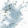
| 09/29/2003 08:16:36 AM |
Pigeonsby rickhd13Comment: An interesting effect, but the composition of the pigeons looks random and chaotic. I like the use of contrast and grain. 6 |
| Photographer found comment helpful. |
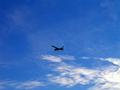
| 09/29/2003 08:14:05 AM |
In Flightby WILDBLUEComment: I wonder why you chose to place the plane in the centre of the frame? This is usually not a good place to put your subject, and I really don't think it works here. If it was on the right, it would make sense as the negative space would exist compositionally for it to fly into. The clouds don't seem to work as a compositional device either, and look accidental here. For a stronger shot, an additional element is needed, such as an interesting cloud formation, sunset, or foreground element. 5 |
| Photographer found comment helpful. |
| 09/29/2003 07:21:02 AM |
Dreams of a Nut - Absurdby tariqueComment: This was the first shot that came up when I started voting. Things went rapidly downhill! Very inventive shot, original is an understatement. SUPERB use of light and shadow, the composition is excellent. 10 |
| Photographer found comment helpful. |
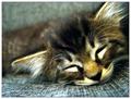
| 09/29/2003 07:18:26 AM |
Jackby TarbiniComment: My favourite shot this challenge, just fantastic. Beautiful textures, colours and use of light. Although the cat's face is JUST out of focus, this looks deliberate and is very effective. The sharp focus of the material in the foreground looks great, especially with such a narrow dof. If only every pet picture this challenge had such a thought out background. Everything is exposed perfectly, difficult given the large range of tones here. Well done. 10 |
| Photographer found comment helpful. |
| 09/29/2003 07:13:50 AM |
Watching the world go byby robsmithComment: Beautiful... unusual but effective composition, great light and shadow, good use of duotone with a well chosen hue. This photo evokes a wonderful mood. I won't be surprised to see this win a ribbon. 10 |
| Photographer found comment helpful. |
Home -
Challenges -
Community -
League -
Photos -
Cameras -
Lenses -
Learn -
Help -
Terms of Use -
Privacy -
Top ^
DPChallenge, and website content and design, Copyright © 2001-2026 Challenging Technologies, LLC.
All digital photo copyrights belong to the photographers and may not be used without permission.
Current Server Time: 07/25/2026 08:53:44 AM EDT.