| Image |
Comment |
| 10/06/2003 05:33:00 AM |
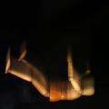
He never came!by kiwinessComment: Beautiful model and dress. Shame about the white balance... the skin seems very orange. The photo is just a little underexposed for my taste. Great idea, it made me laugh out loud (not because I'm heartless! It's a great idea for nightmare). The background could enhance the foreground more if it were darker. On the whole, I like this though! 8 |
 Photographer found comment helpful. Photographer found comment helpful. |
| 10/06/2003 05:28:39 AM |
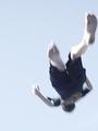
Falling Nightmareby StevePaxComment: Interesting, and nice application of motion blur. However, I don't think the framing has helped here. IMO, to give an impression of falling you need a lot more negative space, and a portrait oriented frame as opposed to a square one. The square frame makes it look like he's just falling to the bottom of a box. 6 |
| Photographer found comment helpful. |
| 10/06/2003 05:24:27 AM |
Ever Hit Bottom?by backslashComment: Interesting idea, and almost works for me.
It\'s a fine line between a blurry shot that works artistically and one that doesn\'t, and this is just the wrong side of it for me. Maybe if you\'d included a background (or something in the background) that was blurred while the subject was sharp this would have been much stronger. 6 |
| Photographer found comment helpful. |
| 10/06/2003 05:20:06 AM |
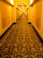
lost in the golden labyrinthby tp-fcpComment: Nice idea, but a few weaknesses need to be corrected:
There's a bad orange cast as a result of using the wrong white balance.
The photo needs rotating slightly clockwise.
It looks like you were trying to horizontally centre the far end of the corridor, which hasn't happened.
IMO, to take this photo up a notch, you need an extra element such as a person running, looking scared, etc. Or, depending on your camera, you could have a motion blurred zoom centred on the far end. 6 |
| Photographer found comment helpful. |
| 10/06/2003 05:16:00 AM |
I dreamt I was on a Greek island again......by Apollo2077Comment: Lovely idea, the moon especially. The birds are a bit hard to make out though, and the lighting on the town is a bit harsh, resulting in a bit of glare. The colours aren't quite vibrant enough. Great atmosphere and feel though. 6 |
| Photographer found comment helpful. |
| 10/04/2003 10:14:46 PM |
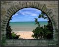
Glencoe Beachby pitsamanComment: Beautiful, but there's some serious pixelation there. Also seems to be loads of noise caused by sharpening. Great composition, mood and colours though. |
| Photographer found comment helpful. |
| 10/02/2003 05:40:42 AM |
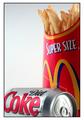
...and a Diet Coke... and Supersize that please!by dsa157Comment: Darn, my idea I never got around to carrying out. I'm glad I didn't, because this is better than what I would have done, I'm sure. Great lighting... good to see you avoided glare on the can. Nice background, very effective. Good composition. Nice work. 8
Edit: Incredibly, this is the only photo I gave 8+ to, making this my favourite and highest scoring picture. |
| Photographer found comment helpful. |
| 10/02/2003 05:25:10 AM |
First Amendmentby elemessComment: I have no idea what is going on in this photo. Do you need to be American to get this? 1 |
| Photographer found comment helpful. |
| 10/02/2003 05:23:28 AM |
American self-ironyby brintamComment: Such a nice use of this awful pun, that I'll overlook the description actually asked for something 'ironic'. Maybe I'll overlook it because American irony is ironic (ho, ho, ouch)? Great composition, shame the highlights on the iron are a little burnt out. 7 |
| 10/02/2003 05:19:18 AM |
|
Home -
Challenges -
Community -
League -
Photos -
Cameras -
Lenses -
Learn -
Help -
Terms of Use -
Privacy -
Top ^
DPChallenge, and website content and design, Copyright © 2001-2026 Challenging Technologies, LLC.
All digital photo copyrights belong to the photographers and may not be used without permission.
Current Server Time: 07/25/2026 03:18:51 PM EDT.