| Image |
Comment |
| 10/29/2003 05:40:35 AM |
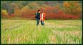
you & meby jackditchComment: For me, the most underrated picture this challenge. Great composition... I'm not normally a fan of centred subjects, but it works well here. The shot is perhaps a little oversaturated and oversharpened, but it's a great Autumn picture. I was going to add this to my favourites, but I notice you haven't been too generous with your 'helpful' ticks on the comments below so I think I'll add another shot instead. I do feel that many people deserve a tick who put time and effort into giving you a perfectly helpful and reasonable comment. |
 Photographer found comment helpful. Photographer found comment helpful. |
| 10/28/2003 06:17:15 PM |
|
| 10/28/2003 06:16:41 PM |
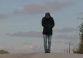
Alone no more...by bruskiComment: Definitely meets the challenge. My only criticism is that it's a shame about the burnt out highlights on the shoulder and upper arm. Superb composition, powerful implementation of a creative idea. 10 |
| Photographer found comment helpful. |
| 10/28/2003 06:15:21 PM |
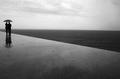
Grado, Italyby paolobnrComment: Beautiful, classy, simple, elegant. Great composition and use of leading lines. Wonderful soft-focus. I like the use of sillhouette. Black and white works nicely here. My favourite this challenge. 10 |
| Photographer found comment helpful. |
| 10/28/2003 05:33:16 PM |
|
| Photographer found comment helpful. |
| 10/28/2003 05:30:13 PM |
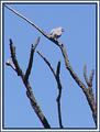
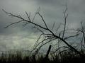
Doveby sulamkComment: Way too oversharpened, and the border is completely inappropriate by being far too overbearing for the photo. I prefer bird shots where the bird is facing the photographer, or side-on. I like the composition of the branches though. 4 |
| Photographer found comment helpful. |
| 10/28/2003 05:17:27 PM |
MEXICAN LONELINESSby euskadiComment: Lovely shot, but her expression doesn\'t give the shot much of an atmosphere of loneliness. The exposure is pretty good (apart from the odd burnt highlight), considering the range of tones you\'ve tried to capture. 6 |
| Photographer found comment helpful. |
| 10/28/2003 05:14:33 PM |
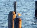
Lonerby seabrookComment: Shame it's out of focus. The subject is too centred in the composition for my taste. The beak ideally needs to contrast with the background... here half of it is lost against a wooden post. The arrangement of the posts in the frame seems haphazard and not balanced. I do like the sunset colours on the side of the two foreground posts though. 4 |
| 10/28/2003 05:11:27 PM |
|
| 10/23/2003 05:46:25 AM |
Lemon Grass infused Spring Rolls by JC_HomolaComment: Sorry I didn't comment on this photo during the challenge, but I thought you should know this was the only photo I gave a 10 to. I loved the shot, which was heads and shoulders above the rest. Congrats on the ribbon! |
Home -
Challenges -
Community -
League -
Photos -
Cameras -
Lenses -
Learn -
Help -
Terms of Use -
Privacy -
Top ^
DPChallenge, and website content and design, Copyright © 2001-2026 Challenging Technologies, LLC.
All digital photo copyrights belong to the photographers and may not be used without permission.
Current Server Time: 07/26/2026 01:54:10 AM EDT.