| Image |
Comment |
| 11/14/2003 05:32:35 PM |
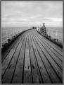
Path to the infinite sea...by BobsterLobsterComment: I didn't add vignetting... it's probably the soft edges reported as a problem with my Optio S in wide angle. Luckily it doesn't spoil the shot too much! If I made the boards vertical... the horizon would slope... are you sure you would want that?! ;) Message edited by author 2003-11-14 17:33:11. |
| 11/12/2003 09:53:55 PM |
|
 Photographer found comment helpful. Photographer found comment helpful. |
| 11/12/2003 07:09:06 AM |
|
| Photographer found comment helpful. |
| 11/11/2003 11:04:55 AM |
Still Lifeby MichaelsComment: Wonderful shot, everything is so right in this photo. Gorgeous green, great composition, nice use of negative space. I love the round leaves. The white background works brilliantly. 10 |
| Photographer found comment helpful. |
| 11/11/2003 11:02:05 AM |
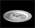
Wish Boneby JackoComment: A seemingly simple shot, captured perfectly. The reflections in the plate work well. The range of tones and exposure are perfect. The lighting is just right. The only thing I would criticise is the amount of negative space, which doesn't quite work for me. 9 |
| Photographer found comment helpful. |
| 11/11/2003 10:59:59 AM |
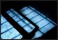
brokenby JasperComment: Creative shot, very imaginative high-key picture. Refracted light always seems to do well here at DPC, so I expect to see this score highly. Interesting juxtaposition of straight lines and curves. The splash of blue works nicely. 9 |
| Photographer found comment helpful. |
| 11/11/2003 10:55:16 AM |
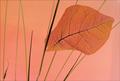
Fallen Leafby JeanComment: Beautiful, minimalist shot. Great and unusual composition. Nice range of tones. 9 |
| 11/11/2003 10:19:35 AM |
When every day is the sameby i_skyComment: Intriguing abstract... I don't 'get' how the title matches the picture, but I very much like the composition, textures and colours. It's a little bit of a stretch from 'still life' in my book for an 8+ score. However, score: 7 |
| Photographer found comment helpful. |
| 11/11/2003 09:00:17 AM |
Just Add Breathby KoriyamaComment: Bravo! I'm guessing you used a projector... now I want one for all my instrument shots! I really would have prefered the top-left to bottom-right diagonal though, the one you chose always seems to jar with me. I think the border needs to be a bit more subtle... a good border never draws attention away from what it's framing IMO.The hue is just a little too yellow-orange for my taste, and looks just a little like the wrong white balance was used. However, I love this photo... and now desperately want to copy it! 9 |
| Photographer found comment helpful. |
| 11/11/2003 08:53:03 AM |
A Reflection of Digital Evolutionby jspencer1962Comment: I'm sure it is within the rules to do a horizontal flip so the writing would be the right way round. The shadows and corners in the background seem accidental rather than deliberate, and take away from the 4 subjects. The photo is crying out for unsharp mask. I think the photo could do with a curves adjustment to increase the contrast without losing the shadow detail. 4 |
Home -
Challenges -
Community -
League -
Photos -
Cameras -
Lenses -
Learn -
Help -
Terms of Use -
Privacy -
Top ^
DPChallenge, and website content and design, Copyright © 2001-2026 Challenging Technologies, LLC.
All digital photo copyrights belong to the photographers and may not be used without permission.
Current Server Time: 07/26/2026 12:25:10 PM EDT.