| Image |
Comment |
| 01/02/2010 11:24:46 AM |
Carry on the Lifeby bnileshComment: Agree with nice focus and DOF, green of background is awesome, nice attentive subject who seems very interested in you. The lighting on the face does not quite work for me; might try brightening the face up just a bit if that is possible without blowing out the small section that is in direct sunlight. |
 Photographer found comment helpful. Photographer found comment helpful. |
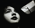
| 01/02/2010 11:13:43 AM |
zoe-xmas-09.jpgby hesitantComment: Nicely posed and lit, BG is excellent. You might sharpen the face a bit, in particular the eyes/eyebrows and lips/teeth. I am fine with the strands of hair the way it is, but I agree with the suggestion to lighten the teeth. |
| Photographer found comment helpful. |
| 01/02/2010 11:08:56 AM |
girl by the stairsby JutildaComment: Cool albeit non-traditional edit. To my eye the white thing on the right adds some balance, but you might crop out about half of it so it plays a smaller part in the image. |
| Photographer found comment helpful. |
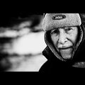
| 01/02/2010 11:04:58 AM |
Old Manby gsalComment: Another great composition with excellent tones. The primary plane of focus on the hat rather than the face is cool! |
| Photographer found comment helpful. |
| 01/02/2010 10:44:55 AM |
Marelieby StructorComment: A belated congrats from me as well! Lovely portrait. Great smile. Like the "old postcard" look, but would love to see how this looks with more traditional processing as well. |
| Photographer found comment helpful. |
| 01/02/2010 10:42:25 AM |
photographer in photo.jpgby SoulJanceComment: An excellent example of how a cool location (and in this case also the dramatic processing thereof) can really make for a great portrait. Nice! |
| Photographer found comment helpful. |
| 01/02/2010 10:39:29 AM |
|
| Photographer found comment helpful. |
| 01/02/2010 10:32:26 AM |
peekabooby LutchenkoComment: Nice crop and use of empty space. The selective desaturation works nicely. But the bluishness on her lips bothers me a bit because it strikes me as being a result of the lighting rather than applied cosmetically -- I would prefer it be all pink or red. |
| Photographer found comment helpful. |
| 01/02/2010 10:24:20 AM |
Bababy vladoComment: Lots of character on display here. Nice pose and composition, the brown/white works well here. Somehow the light ended up a bit blotchy due to the way the shadows fell, perhaps a slightly different angle of the lighting would have worked better. |
| Photographer found comment helpful. |
| 01/02/2010 10:18:44 AM |
me2.jpgby deersComment: I agree, the harshness works well here. But I would clone out the vertical stripe that is just to the left of the face (should be relatively easy to do). |
Home -
Challenges -
Community -
League -
Photos -
Cameras -
Lenses -
Learn -
Help -
Terms of Use -
Privacy -
Top ^
DPChallenge, and website content and design, Copyright © 2001-2026 Challenging Technologies, LLC.
All digital photo copyrights belong to the photographers and may not be used without permission.
Current Server Time: 07/21/2026 08:51:43 PM EDT.