|
|
|
Showing 2801 - 2810 of ~4876 |
| Image |
Comment |
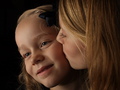
| 12/22/2008 10:33:07 PM | A Sister's Kissby cavemanrodComment: Greetings from the critique club...
My first impression is that this is a great photograph. I was not able to vote for this challenge, but if I had, I would probably have given this image a 7.
From a technical standpoint, the image is balanced, the focus is incredibly sharp, and the lighting is diverse.
You've done a very good job at showing the viewer there are 2 light sources, and this is reflected in your score. I really enjoy the shape of the catch light in her eyes.
Congrats on your top 10 finish.
If you need any clarification on any of my comments, please feel free to pm me. It might take some time for me to get back to you. |  Photographer found comment helpful. Photographer found comment helpful. |
| 12/22/2008 10:27:22 PM | A Different Lightby posthumousComment: Greetings from the critique club...
I wasn't able to vote on this challenge, but if I had, I probably would have given this image a 6.
My first impression is that this is a very interesting photo that almost appears to have been painted. It looks very much like an impressionist painting. There is an emotional quality that keeps my interest.
From the stand point of the theme, I can tell very clearly that a fill flash was used. The fill flash is subtle compared to some of the other photogrpahs, but that is no way reflective of the success of the photo. I'll assume the subtelty is why the image didn't score higher, but you and I both know that's not why you're here ;)
Keep up the good work. I enjoy your contributions to this website.
If you need any clarification on any of my comments, please feel free to pm me. It might take some time for me to get back to you. | | Photographer found comment helpful. |
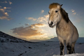
| 12/22/2008 10:20:31 PM | Moment in time by BrinComment: Greetings from the critique club...
Well Brin, you've put me in the difficult position of giving you some constructive criticism. I often see your photographs on the front page, and aspire to be as consitent as you.
You've done an excellent job at tackling the challenge theme. It is quite obvious a fill flash has been used to capture the details of the horse. I love how you have placed the sun behind the subject. It avoids overexposure in the sky, and also gives a halo effect around the main subject. You've balanced the photograph well by using the rule of thirds. If I had to find one thing to improve, I would prefer to see a little more snow between the horses feet and the bottom of the photograph. Such a minor criticism, but I wouldn't feel helpful if I didn't have something to contribute.
Keep up the good work!
If you need any clarification on any of my comments, please feel free to pm me. It might take some time for me to get back to you. | | Photographer found comment helpful. |
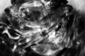
| 12/22/2008 10:13:05 PM | Jelly Fishby mgarsteckComment: Greetings from the critique club...
If it weren't for your description, I wouldn't have been able to guess what this was. A very interesting abstract photograph. This might have done well in the "Abstact Macro" challenge.
The main room for improvement is not the photograph itself, but how the photograph relates to the challenge. For a "fill flash" challenge, most viewers are expecting to see a dominant light source with the use of a secondary (fill flash) light source to fill in the darker areas. This is difficult to discern in your photograph since we cannot see either of the light sources. I believe this is the main reason your photograph did not score higher.
If you need any clarification on any of my comments, please feel free to pm me. It might take some time for me to get back to you. | | Photographer found comment helpful. |
| 12/22/2008 10:09:05 PM | Best beansby PikkelComment: Greetings from the critique club...
My first impression is that the scene is a little busy overall. The ground up beans that have fallen on the whole beans makes for a very confusing image. I took me a few seconds to realize there was a spoon holding the ground beans. The spoon is so bright that it merges with the background. I agree with the other commenters who said the image could be sharper.
Overall, a little more care in the setup will go a long way in the quality of your photograph.
I look forward to seeing more of your photographs.
If you need any clarification on any of my comments, please feel free to pm me. It might take some time for me to get back to you. |
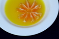
| 12/22/2008 10:03:03 PM | Lily ....by PanksComment: Greetings from the critique club...
I like the approach you have taken with you photograph. Instead of just placing 2 objects side by side, you have combined them to create an interesting photograph. Bonus points for you!
I like the abstract nature of this photograph. A square crop might work better here if you cropped off the left side of the photograph. As it stands right now, the curve of the bowl leads the viewers eye away from the center. There are plenty of plate photographs on this site with a square crop. Browse around to see what I am talking about. The crop is also a little awkward as the oranges are cropped in a manner that does not look deliberate. I would prefer to see them not cropped at all.
If you need any clarification on any of my comments, please feel free to pm me. It might take some time for me to get back to you. |
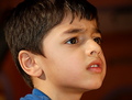
| 12/22/2008 09:51:57 PM | now what was that again?by arati_halbeComment: Greetings from the critique club...
My first impression is that this is not far from being an excellent photograph. Your crop is very good. You've cropped the boys head, but done it in such a way that it is deliberate. You've also left some negative space to the right to give the subject an area to look into. From a technical stand point, the image seems a little soft overall. It's diffucult to tell on this monitor, but the photo might be a little yellow overall.
As for fitting the theme, you've done a great job. It is very obvious there is more than one light source. The catch light in the boys eye is also very nice.
Keep up the good work.
If you need any clarification on any of my comments, please feel free to pm me. It might take some time for me to get back to you. | | Photographer found comment helpful. |
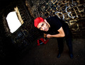
| 12/22/2008 09:42:53 PM | Windowsby MAKComment: Greetings from the critique club...
I wasn't able to vote on this challenge, but if I had, I probably would have given this image a 6. This photograph fits the theme very well. The window in the background lets the viewer know there is a primary light source, and that a flash was used to fill in the details on the models face. From that stand point, you have done very well.
Artistically, there are 2 areas where I have some suggestions. First of all, I am really not sure what it is the model is doing. Is he holding a shovel? Is he pulling a sled? While a photograph doesn't have to be crystal clear in subject, I think it might have helped out a little more when it comes to viewers votes. Also, I quite like the red hair because it stands out from everything else and helps establish a focal point (the mans head). I find the red (shirt?) in the background is fighting for attention. Had it not been there, the red hair on the man would have jumped out that much more. Interesting shot overall.
If you need any clarification on any of my comments, please feel free to pm me. It might take some time for me to get back to you. | | Photographer found comment helpful. |
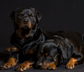
| 12/22/2008 09:33:47 PM | Two Friendsby SnapperLComment: Greetings from the critique club...
What a beautiful photograph. The poses are great, and shooting two dark dogs on a dark background is no easy feat! Technically speaking, there isn't anything I can add that would improve this photograph.
As for fitting the theme, "fill flash" is not the first thing that comes to mind. I wasn't able to vote for this challenge, but if I did, I probably would have given you a 6. Fill flash, to me, usually indicates that there is one light souce that is brighter and more dominant, and that the "fill flash" is filling in the darker areas. I don't get that feeling from this photograph. I am by no means an expert, and it is very possible my definition of fill light needs to be expanded, but I just wanted to share my opinion.
Congratulations on a wonderful shot.
If you need any clarification on any of my comments, please feel free to pm me. It might take some time for me to get back to you. | | Photographer found comment helpful. |
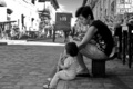
| 12/22/2008 09:23:38 PM | Mother to Daughterby denboteComment: Greetings from the critique club...
This is a very personal photo as we can see the interactions of the mother and the daughter. I like the choice of black & white, as it allows us to focus on the subjects emotions. I also like the contrast in dark & light clother between the two main subjects.
The crop seems a little awkward as the daughters shoe is just barely touching the bottom of the photograph, and doesn't appear deliberate. I quite like the blown out hightlights in the background, but at this point they are competing for attention. Perhaps a tighter crop would aleviate the problem.
If you need any clarification on any of my comments, please feel free to pm me. It might take some time for me to get back to you. | | Photographer found comment helpful. |
|
Showing 2801 - 2810 of ~4876 |
Home -
Challenges -
Community -
League -
Photos -
Cameras -
Lenses -
Learn -
Help -
Terms of Use -
Privacy -
Top ^
DPChallenge, and website content and design, Copyright © 2001-2026 Challenging Technologies, LLC.
All digital photo copyrights belong to the photographers and may not be used without permission.
Current Server Time: 07/25/2026 07:52:26 AM EDT.
|