|
|
|
Showing 961 - 970 of ~9205 |
| Image |
Comment |
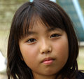
| 09/02/2008 03:41:24 PM | Girl Oneby Pug-HComment: Good details and I like the lighting. It feels a little tight (to me), and I'm wondering what a wider framing of the shot would look like. |  Photographer found comment helpful. Photographer found comment helpful. |
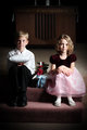
| 09/02/2008 03:40:18 PM | Kiddos.jpgby Patrick_RComment: I like the "formality" of their poses, and how they actually look stiff and uncomfortable. I know that is usually the opposite of what you try to achieve with kid pics, but it works really well here. The side of his face is just a bit too shadowed, for my taste. If it were just him, I think it would be okay, and would even be a nice effect. However, since the flower girl's face is not as shadowed, it looks a little off-balanced to me. | | Photographer found comment helpful. |
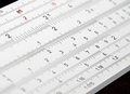
| 08/27/2008 04:40:39 PM | 12 x 14 equals ...by bjoernComment: CRITIQUE CLUB CRITIQUE
by karmat
Compositionally, I think this is a strong entry. The overall diagonal of the shot makes it feel like there is more than just one place to "look," and it adds interest.
Technically, I really like the dof you have chosen to use. Any more, and all the numbers would have made it a confusing mass to try to see. As it is, the numbers that are focused look good. Also, the simple colors of this make it a pleasing shot to view.
Overall, it is a good shot. In looking at your voting breakdown, though, I suspect there just wasn't enough overall "interest" to compel the voters to vote higher. It is a slide rule, and that is about it. Perhaps if there could have been some context or use involved in the shot, it may have appealed or "reached" more people.
Karma | | Photographer found comment helpful. |
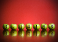
| 08/27/2008 04:36:50 PM | Apple Pi by freakin_hilariousComment: CRITIQUE CLUB CRITIQUE
by karmat
What can I say? You obviously have a good shot here. :)
Some things that work well --
1. The apples are all similar in shape and size. Had they been different or of obviously different shapes, the unity of the shot would not have been as strong and it would not have made the shot as pleasing.
2. The contrast between the red of the background and the green of the apples is wonderful.
3. The obvious care you took with the numbers. Just drawing them on there, or sticking them on with something would have lacked the polished look of this. It adds some dimension, though subtle, and professionalism to the shot.
Very well done and congrats on teh ribbon!
karma | | Photographer found comment helpful. |
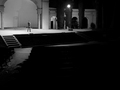
| 08/23/2008 12:09:30 AM | Out-of-Work Actorby zackdezonComment: Critique Club Critique
by karmat
OK, upon second guess, I didn't rate quite as high as I should have. I apologize for that.
Compositionally, I like the balance between the light and dark areas of the shot. It's not quite completely even, but enough to to give it a balanced feeling. I also like how the actor is completely alone "up there."
Technically, it is a good bw shot. The contrast level is good, and there isn't a lot of "murky" grays. The focus, clarity, etc is good, and you stand out well against the background.
A couple of your commenters mentioned eliminating or reducing the amount of black in the foreground. On one hand, I can see this. It would draw more attention to your subject, and seem like less of a wasted space. On the other hand, the way you've done it makes it feel so empty and bleak.
Nice work and best to you in future challenges.
Karma
| | Photographer found comment helpful. |
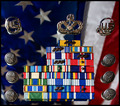
| 08/22/2008 11:57:51 PM | I Am An American Airmanby BHusemanComment: Critique Club Critique
by karmat
Compositionally, I like the "almost" or implied symmetry of this shot. The round 'things' on the outside give it a sense of balance, yet the bars in the middle are not symmetrical, so it changes things up a bit. I think that helps it to seem not quite so static. That said, it feels a bit tight on the left and right.
Technically, the focus, colors and clarity of this are excellent. I, personally, like the flag in the background because I believe it adds a bit more "context" to the shot. I do think it would be stronger if you could have blurred it a bit more. It's not focused, obviously, but I think more blur might have made it "blend" better into the background. It was a neat idea to have the ribbons and such on a mirror (I assume), as this gives the shot a bit more depth than it normally would have had.
On a personal note, thank you. My FIL is a USAF vet, my husband is a wannabe (he had health problems that kept him out of the service), and my son, at age 6 wants to be a USAF pilot. My hat tips to you, and my thoughts and prayers are with you!
Karma | | Photographer found comment helpful. |
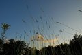
| 08/19/2008 04:22:05 PM | Timothy at Twilightby tearose4Comment: CRITIQUE CLUB CRITIQUE
by karmat
Compositionally, this shot has some nice elements, but there really isn't anything to "tie it together." I like the lower perspective and how we seem to be looking up at at the grass. This perspective adds interest to the shot. However, everything is so random, I find myself asking, "Why was this picture taken." It almost feels like you were taking a picture of something specific, and it exited the frame too quickly. Another thing that might make it feel more balanced would be to move to the right or left (if possible) and not have the tall trees in the background. Use negative space of the sky to balance the "grass strands."
Technically, I like that it is not a silhouette, and that there is some detail visible. Also, your fill flash is subtle enough to be effective. Sometimes, a fill flash can be harsh or look awkward, color wise. Focus seems okay, but there really isn't any detail present (it is all too small and too far away).
Overall, not a bad shot, but one that leaves the viewer feeling a bit amiss. Yes, it does capture the essence of the challenge, but it doesn't seem to have any purpose.
Karma |
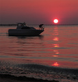
| 08/19/2008 04:04:47 PM | Va beach sunsetby jbirkmanComment: CRITIQUE CLUB CRITIQUE
by karmat
Very nice portrayal of challenge.
Compositionally, I like the balance between the sun and the boat silhouette. I also like the "almost" parallel between the pier and the waterline. It does feel a touch "off" though. I'm wondering if a horizontal crop/composition would make it a bit more stable.
Technically, there seems to be just a little artifacting, which could be caused from adjusting colors, etc. in post processing. I really like the warm pink colors -- it truly conveys a sense of evening and warmth. Likewise, the fact that it is not a true silhouette helps the shot, I think.
Overall, well done, and congratulations on your personal best. I do hope this is the beginning of a trend for you!
Karma | | Photographer found comment helpful. |
| 08/12/2008 01:41:28 PM | | | Photographer found comment helpful. |
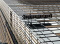
| 08/12/2008 01:41:00 PM | Window washerby kolasiComment: The perspective on this is almost dizzy-ing. Took me a second or two to orient myself. | | Photographer found comment helpful. |
|
Showing 961 - 970 of ~9205 |
Home -
Challenges -
Community -
League -
Photos -
Cameras -
Lenses -
Learn -
Help -
Terms of Use -
Privacy -
Top ^
DPChallenge, and website content and design, Copyright © 2001-2026 Challenging Technologies, LLC.
All digital photo copyrights belong to the photographers and may not be used without permission.
Current Server Time: 06/21/2026 11:55:08 AM EDT.
|