| Image |
Comment |
| 04/17/2002 10:22:00 AM |
Old Gloryby SpeignerComment: Nice shot. I like the contrast the flag makes against the sky. |
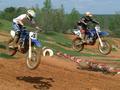
| 04/19/2002 08:26:00 AM |
Fly'in Highby ShiiizzzamComment: Good shot. Another idea would be to zoom as much as possible, if possible, on one of the bikes so the eye doesn't go back and forth. |
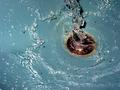
| 04/19/2002 08:14:00 AM |
Splashedby mciComment: Good capture of motion -- what would it look like from different angles? |
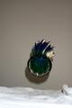
| 04/17/2002 02:38:00 PM |
Cleansingby ReubenComment: A little blurry around the edges, would've been cool if tongue had been visible. If I had gotten close to my cat with a camera, I probably would've needed a first aid cleansing. |
| 04/19/2002 09:11:00 AM |
|
| 04/17/2002 02:40:00 PM |
|
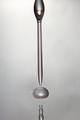
| 04/19/2002 09:23:00 AM |
Indecisionby PixelatedVisionsComment: Too much empty space at the top, some blurring on the right. Nice angle, nice vase, hope it didn't break. |
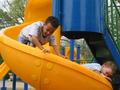
| 04/18/2002 06:04:00 PM |
Down We Goby BambooChicaComment: Zooming in and focusing on the top kid, or getting the first one higher up, may have made the picture a little more effective. I like the bright colors. |
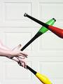
| 04/18/2002 06:14:00 PM |
Club Chaosby GordonComment: Some blurring. More club, less hand would have made it really cool. Good choice of background -- nice color contrasts. |
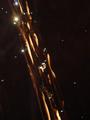
| 04/19/2002 09:27:00 AM |
Fluid Movementby dlhComment: Nice colors. I, for one, like the "starbursts" near the top. |
Home -
Challenges -
Community -
League -
Photos -
Cameras -
Lenses -
Learn -
Help -
Terms of Use -
Privacy -
Top ^
DPChallenge, and website content and design, Copyright © 2001-2026 Challenging Technologies, LLC.
All digital photo copyrights belong to the photographers and may not be used without permission.
Current Server Time: 06/18/2026 02:06:14 PM EDT.