|
|
|
Showing 8901 - 8910 of ~9205 |
| Image |
Comment |
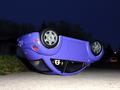
| 05/18/2002 08:29:00 PM | Roll Overby SonifoComment: You know, if you had cut the grass really, really really short on the left side, I would have been convinced that this was a real Beetle. You have done an excellent job, in my opinion, of "composing" the background to make the subject seem larger than it is. Great job. |  Photographer found comment helpful. Photographer found comment helpful. |
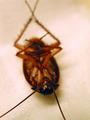
| 05/18/2002 08:59:00 PM | Palmetto Bugby chariotComment: This reminds me of the movie "Men in Black." I would have liked to have seen a little more of it in sharper focus, but I know that can be difficult with a macro shot. I hope this is a macro shot!!!!!!!!! |
| 05/18/2002 09:12:00 PM | Mirror Imageby janfriesComment: Beautiful. The colors of the lake/tree/sky is very nice, and it looks so peaceful and serene. I know someone has probably mentioned the leaves and twig at the top, so I won't. :-) If it had been possible to position yourself so that the diagonal piece of land in the lower left was more prominent, that may have given the picture a little more "direction." It didn't affect the score because I fully realize that may not have been possible, but it might be something to consider. | | Photographer found comment helpful. |
| 05/18/2002 09:08:00 PM | Old-School Text Messagingby albright1Comment: I love the expression on his face. He makes it looks totally spontaneous. However, the blurriness of the calculator, and the clarity of the boy seems to make me focus more on him than the message. Did you use a flash? If so, could you have cut it off? That may have kept the white keys from washing out. |
| 05/18/2002 08:41:00 PM | Through the looking glass by CoreyComment: Good capture and focus. I like the fact that you have to look closely at the picture to see the "upside-down" part, yet it is obvious enough to not totally confound the viewer. The paper and glasses give it a "natural" feel. | | Photographer found comment helpful. |
| 05/18/2002 08:49:00 PM | Untitledby mciComment: This is a good shot. The lighting is very powerful and the composition is nice. Something doesn't sit exactly right with me though. After thinking about it all week, the best way I can describe it is the overall image is "soft," but the way she is holding her hands to cover her breasts is very flexed -- angular and sharp. It gives the impression that she is nervous about posing. maybe relaxing the hands. The expression on her face says, "I am alone in my world; I am reflecting on my world," but her hands say, "This is a picture going international on the internet." How to fix? I don't know without totally ruining the composition. MAYBE if you could have shot at a more upward angle so that she wouldn't have to cover herself, or flattening her hands some. Maybe from the same vantage point, but cross her arms over her like a hug. Then the picture may have given the impression that she has lost something important and is contemplating it. I don't know. |
| 05/18/2002 08:58:00 PM | Twinsby JJartComment: Good idea. Don't know if the contrasting color of the shirts was intentional, but it was effective. I like the way it looks like they are sharing a joke or something, but seemingly oblivious to the camers. |
| 05/18/2002 09:24:00 AM | |
| 05/18/2002 08:35:00 PM | dang... by iraeComment: Man, I hate it when this happens. The change on the floor is a nice touch. I like the black and white, and the simplicity of the shot. |
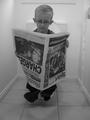
| 05/18/2002 08:26:00 PM | The Thinkerby DavidComment: This was too cute! I hope he got an extra 10% at least in his allowance (if he has one). I really like the fact that he is oblivious to the camera and it looks, shall I say, natural. The black and white also works well for me. |
|
Showing 8901 - 8910 of ~9205 |
Home -
Challenges -
Community -
League -
Photos -
Cameras -
Lenses -
Learn -
Help -
Terms of Use -
Privacy -
Top ^
DPChallenge, and website content and design, Copyright © 2001-2026 Challenging Technologies, LLC.
All digital photo copyrights belong to the photographers and may not be used without permission.
Current Server Time: 06/19/2026 07:39:58 PM EDT.
|